Client work
Maneuver Men’s Grooming
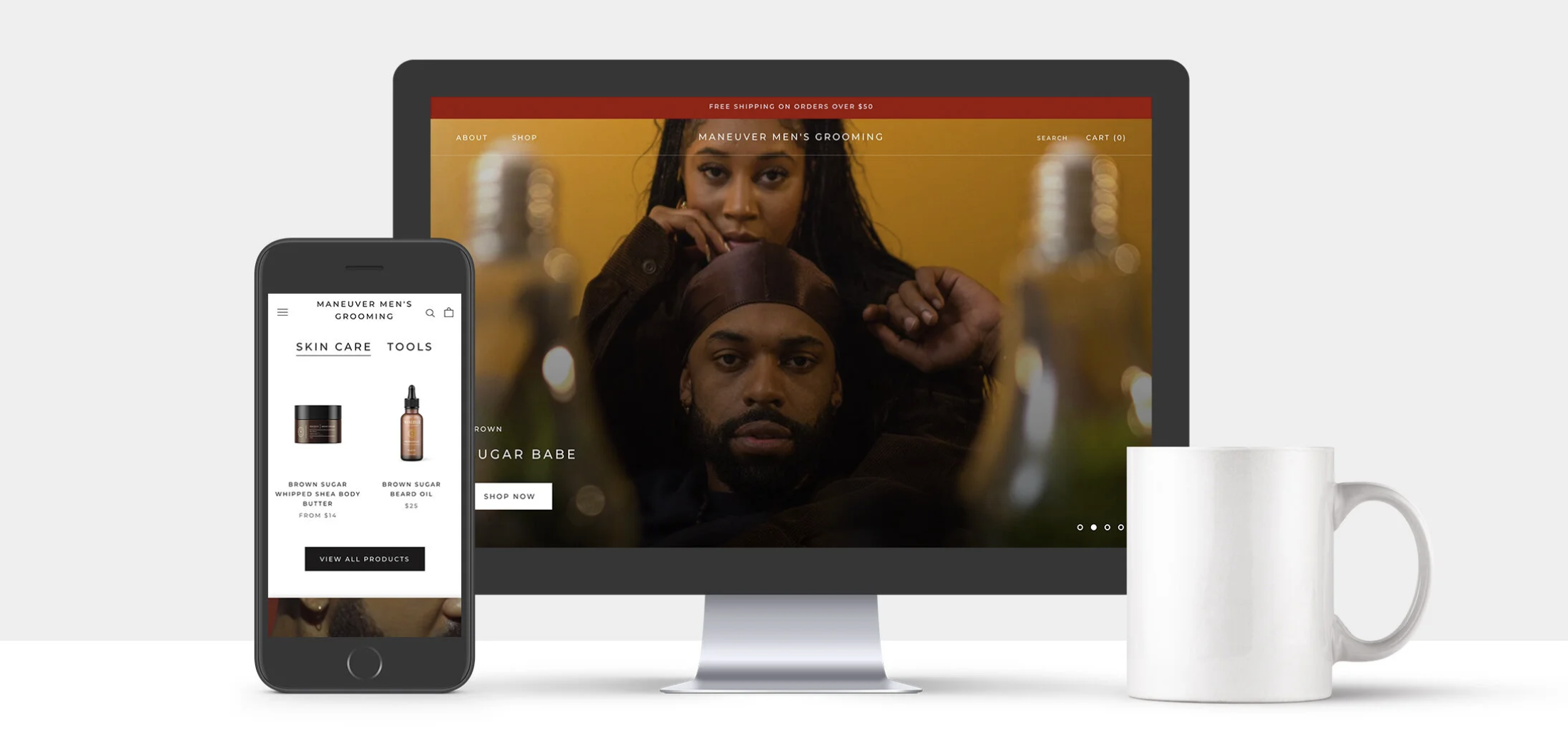
A cohesive brand and digital shopping experience for a men’s grooming company, spanning visual identity, e-commerce website, packaging, and photography.
Overview
A brand and shopping experience built around the product.
Maneuver Men's Grooming is a beauty brand built on shea butter, beard oils, and grooming essentials. I led the creative for its launch: brand and visual identity, the e-commerce website, packaging, and creative direction for the photography and video that supported them.
The aim was a single system: site, product, and imagery should feel like one premium brand.
- Web design
- Branding
- Packaging
- Creative direction
The challenge
Earn trust in a crowded category, then make it easy to buy.
Distinct identity
Establish a premium grooming identity that stands apart from category defaults.
Clear product value
Communicate what each product does and why it belongs in a routine.
Customer trust
Look credible enough that a first-time visitor is comfortable buying.
Easy discovery
Make products simple to find, compare, and add to a cart.
One visual language
Keep the look consistent from the website to the bottle in someone's hand.
Research
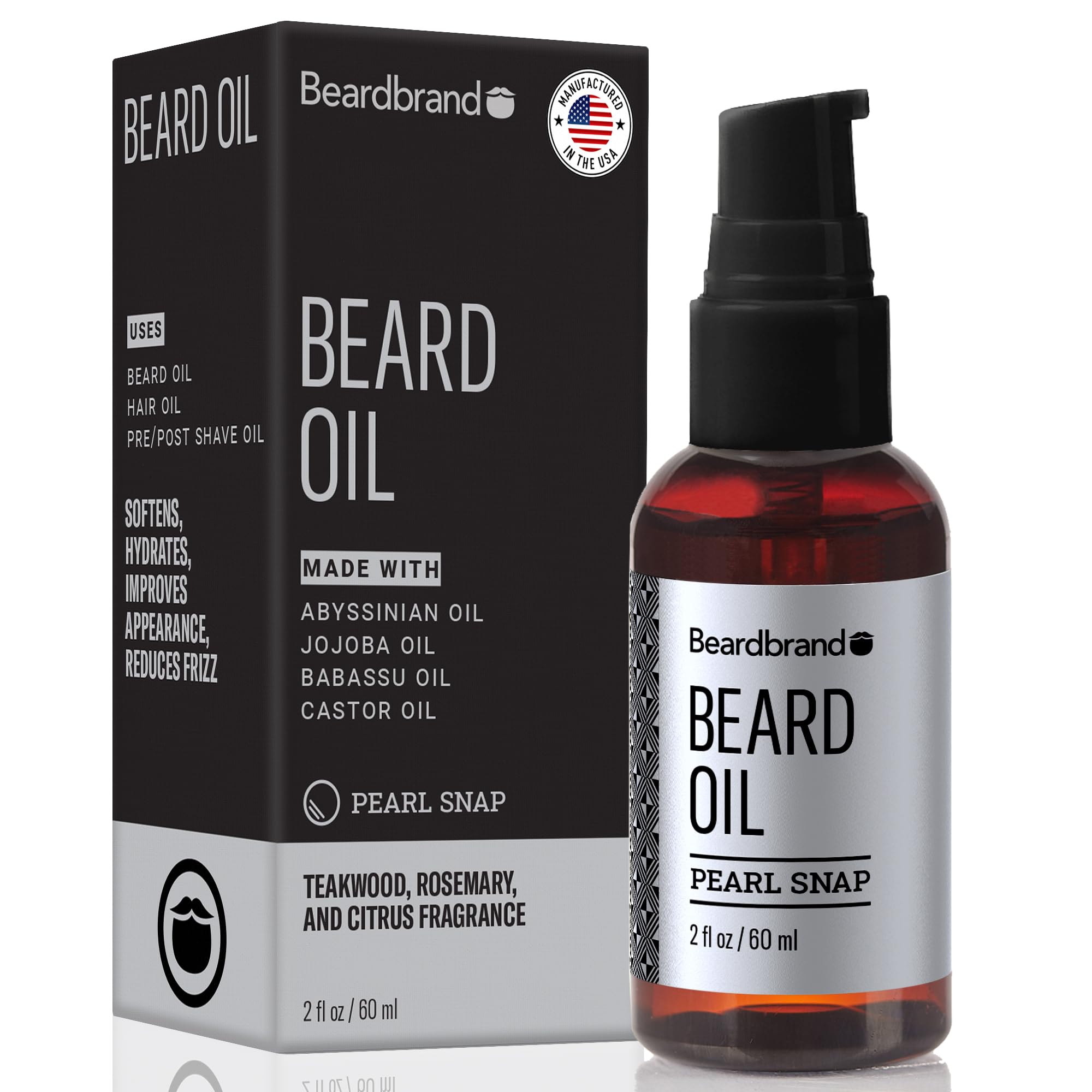
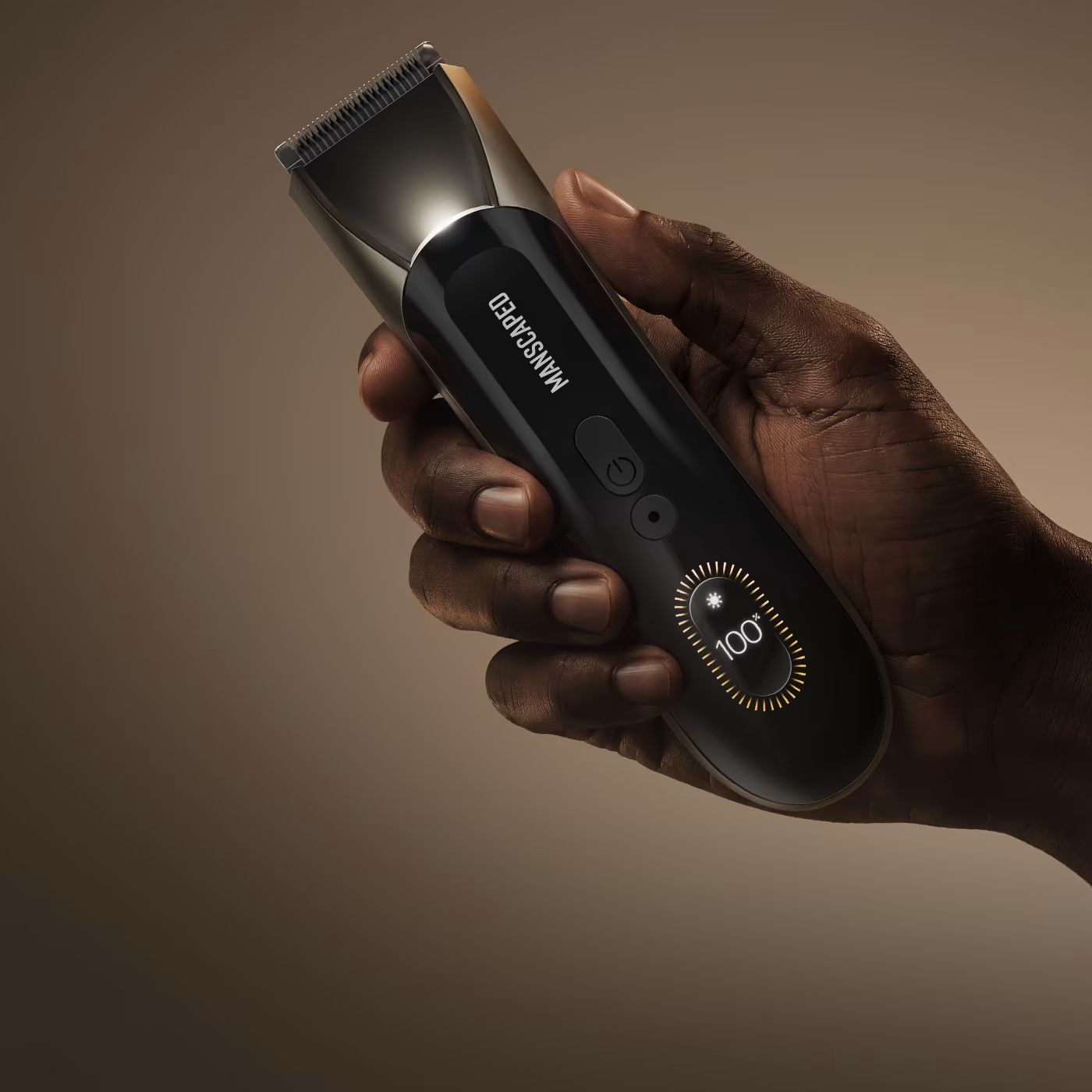
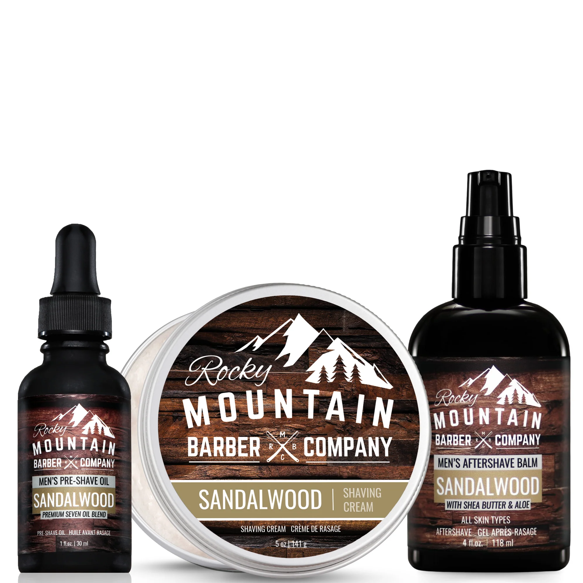
Competitive analysis
I reviewed established grooming and barber brands to understand how they balance product presentation, education, and commerce.
- Brand positioning
- Navigation and e-commerce patterns
- Product presentation
- Photography
- Tone and visual language
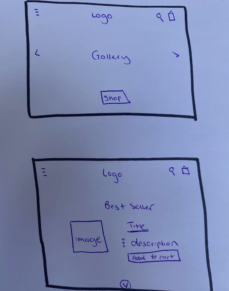
Early exploration
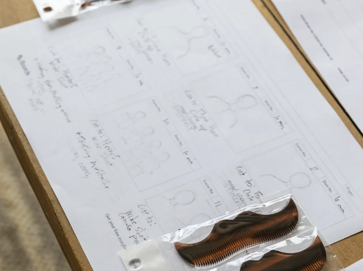
Sketching the shopping flow before the brand
I started on paper, working through structure before style. The sketches focused on how the site should tell the brand's story and get people to the products quickly.
- Page hierarchy. Deciding what leads on the homepage and how a product page earns the purchase.
- Product discovery. Putting products and their descriptions close together so they are easy to scan.
- Homepage storytelling. Using a hero and featured products to introduce the brand in one scroll.
- Navigation. Keeping the structure shallow so the path to a product stays short.
I shared these drafts with the client and used their feedback to shape the first design pass.
Website experience
A storefront led by the product.
After presenting the first drafts and resolving usability issues, I finalized a design meant to make product value clearer and reduce friction from discovery to purchase. The site was built on Shopify.
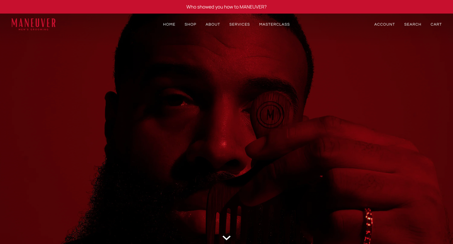
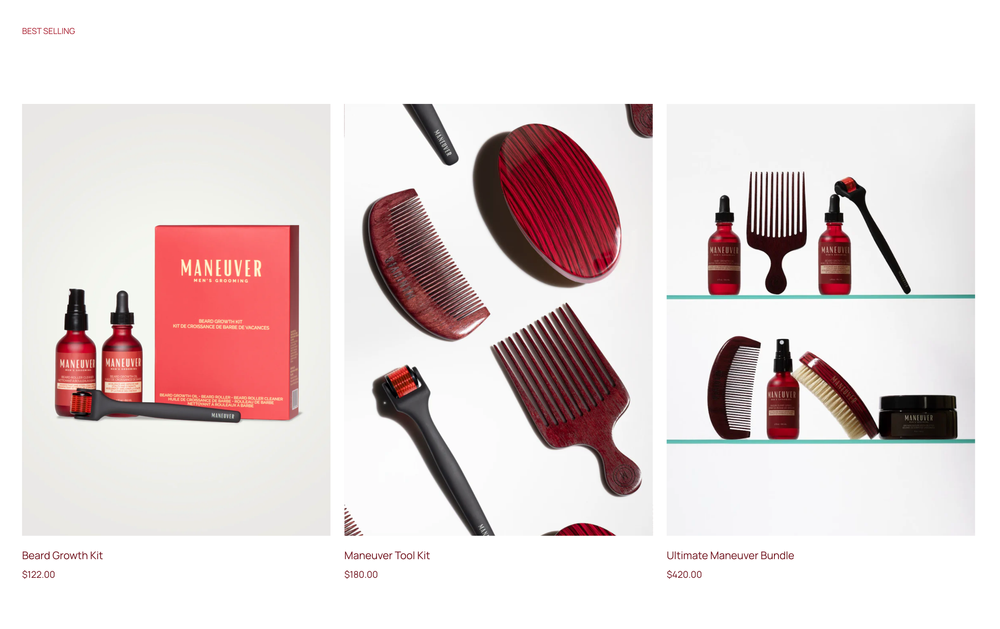
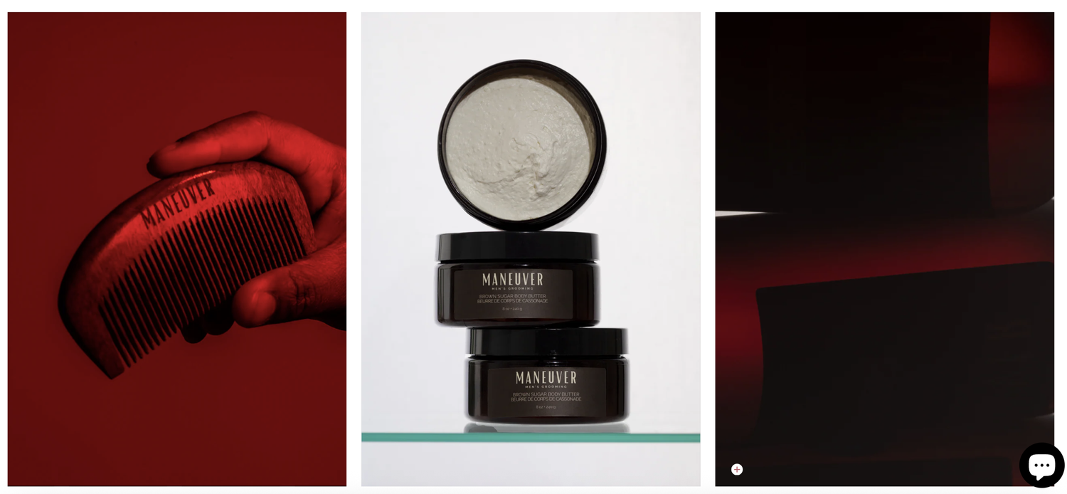
Key design decisions
- Product-led imagery
- Large, well-lit product photography carries the page and does most of the selling.
- Clear hierarchy
- One primary action per view, with product, price, and description in a predictable order.
- Premium visual direction
- A restrained palette and generous space keep the experience feeling considered.
- Simplified navigation
- A short, shop-first menu keeps browsing straightforward.
- Brand continuity
- Colour, type, and photography on the site match the packaging.
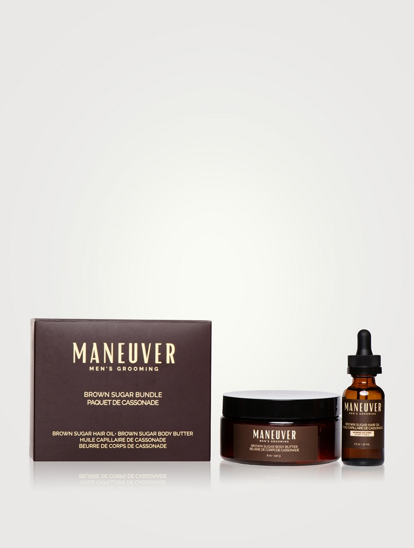
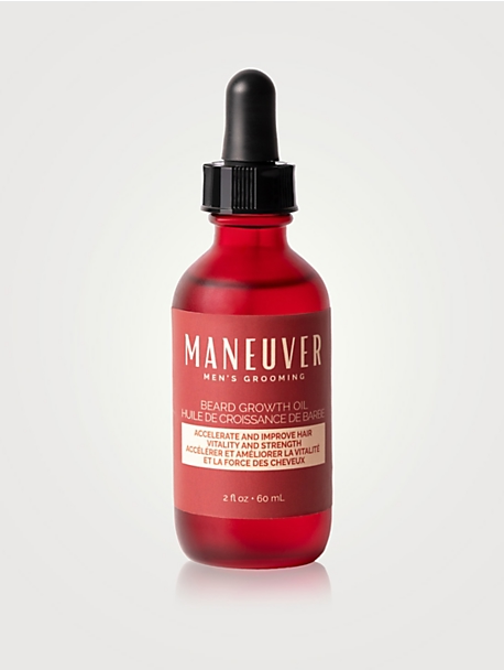
Brand and packaging
From first drafts to a packaging system
With the website and colour palette established, packaging became the physical expression of the same brand. It developed in three steps.
Early direction
Initial drafts
The first packaging drafts applied the brand's colour palette to the product line so the bottles and tins could be judged as a set.
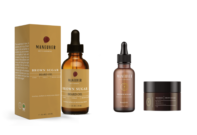
Iteration
Refining with the client
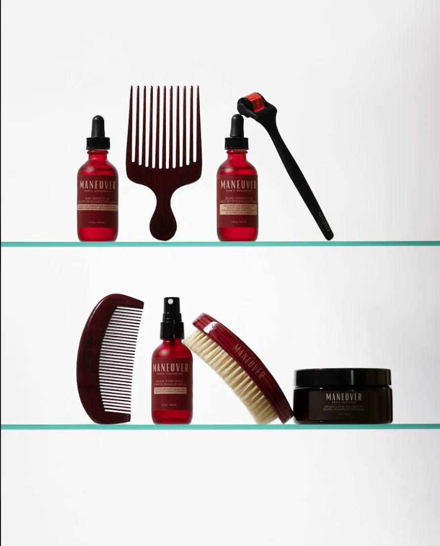
Working from client feedback, we pushed toward a more luxurious look. I recommended moving to dark red amber bottles, which gave the products a richer feel and tied them to the brand colour.
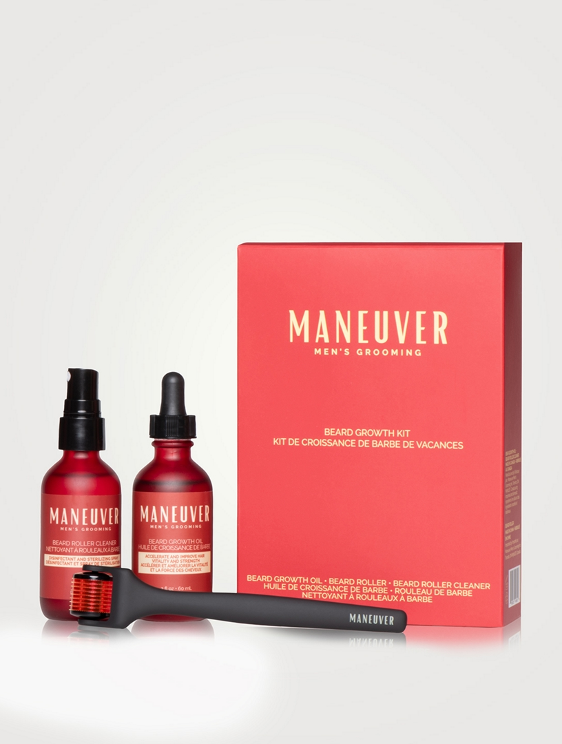
Final system
One cohesive line
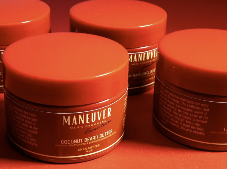
The final packaging gives the full range a consistent, recognizable look on the shelf and in photography.
Photography and art direction
Imagery that sets the tone
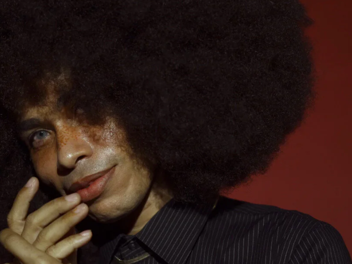
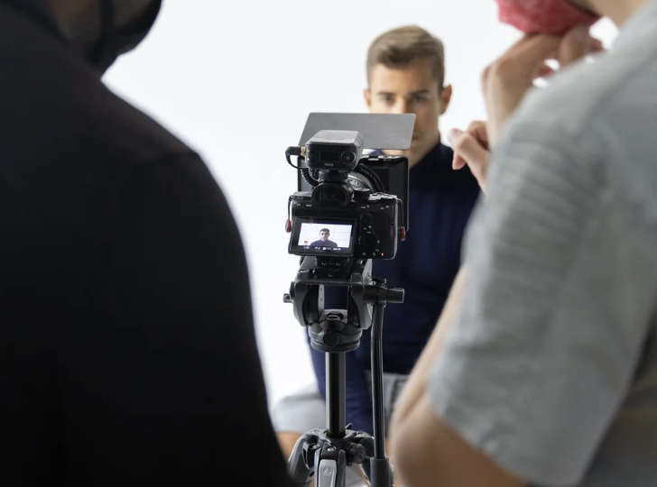
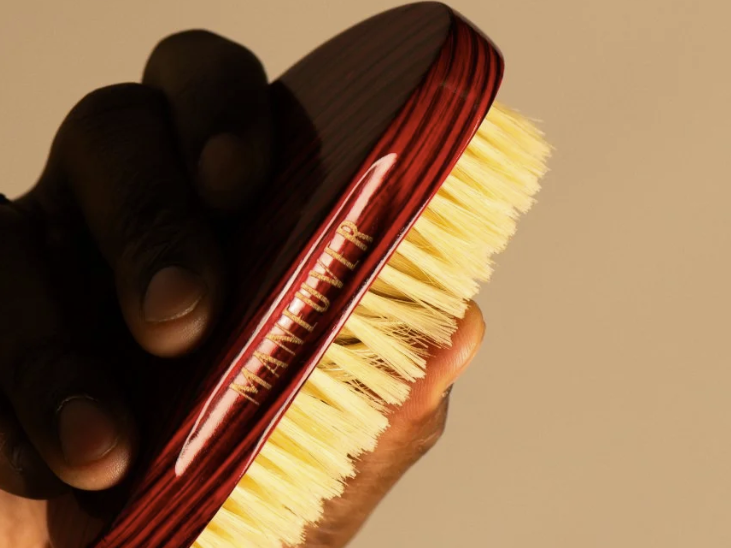
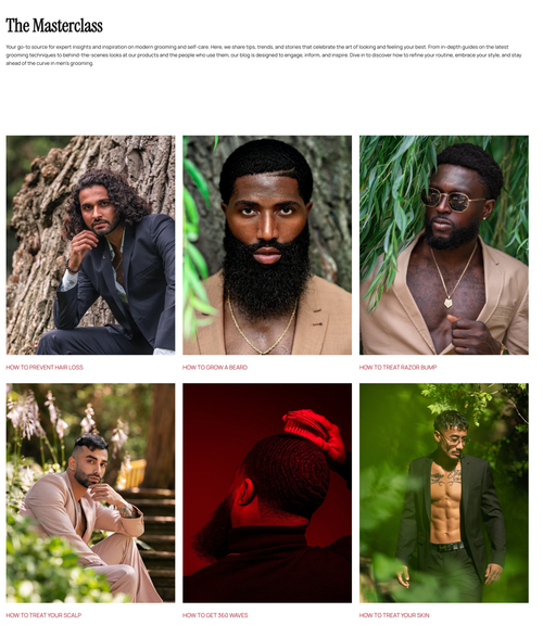
I directed the photoshoot to reinforce a premium, masculine grooming identity. The images do double duty as reusable assets across the website, product marketing, and social channels.
Impact and reflection
What this project showed
A cohesive customer experience
Physical and digital touchpoints share one look, so the brand is recognizable from the first click to the product in hand.
Expression balanced with usability
A premium visual direction that still keeps shopping straightforward.
E-commerce shaped by product storytelling
Strong imagery and clear hierarchy do the work of introducing each product.
Visual systems that scale
Colour, type, and photography were set up to carry across the site, packaging, and marketing.
This project taught me how much a consistent brand system matters when the same customer meets the product in several places. It also reinforced that creative direction and usability work best when they are decided together.