
Fisheries and Oceans Canada
EV Dashboard Redesign
Gap analysis tool for Fisheries and Oceans Canada (DFO)
Role
UX / Product Designer
Team
Jingyi Lai, Quanling Liu, Jake Gu, Aaron Cappuccio
Pictured above: a quick glance of browse features for the dashnoards new design.
01. Overview
The Department of Fisheries and Oceans Canada (DFO) monitors marine ecosystem variables across Canada and relies on an internal dashboard to support conservation and policy decisions. The existing Ecosystem Variables (EV) dashboard had major usability issues making it difficult for scientists and analysts to find relevant data, interpret coverage gaps, and collaborate effectively. Our goal was to redesign the EV dashboard to better match real workflows: find data faster, analyze spatial gaps more accurately, and collaborate in-context without adding complexity.
02. The Problem
Research and analysis identified several recurring issues with the existing dashboard experience:
Limited filtering and search made it hard to narrow down datasets effectively
Low spatial resolution reduced usefulness for regional or precise ecological analysis
Gap analysis wasn’t actionable, users couldn’t easily see where data is missing
Collaboration relied on external tools (email/Teams), breaking context and traceability
Metadata transparency was limited, creating uncertainty about data timeliness and credibility
03. Users & Use Cases
Primary users included DFO marine scientists, analysts, and policy advisors who need to:
Discover ecosystem variable datasets by region and variable type
Understand where monitoring data is strong vs. missing
Validate datasets via metadata (source, timestamps, contacts)
Share findings and discuss interpretations with teammates directly in the tool
Pictured above: views of some of the final approved designs created for the new dashboard.
(Left to Right: Filter selection, Filters applies/graph results, Ocean naviagater)
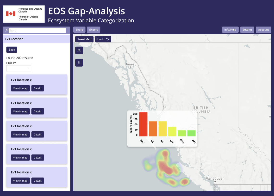
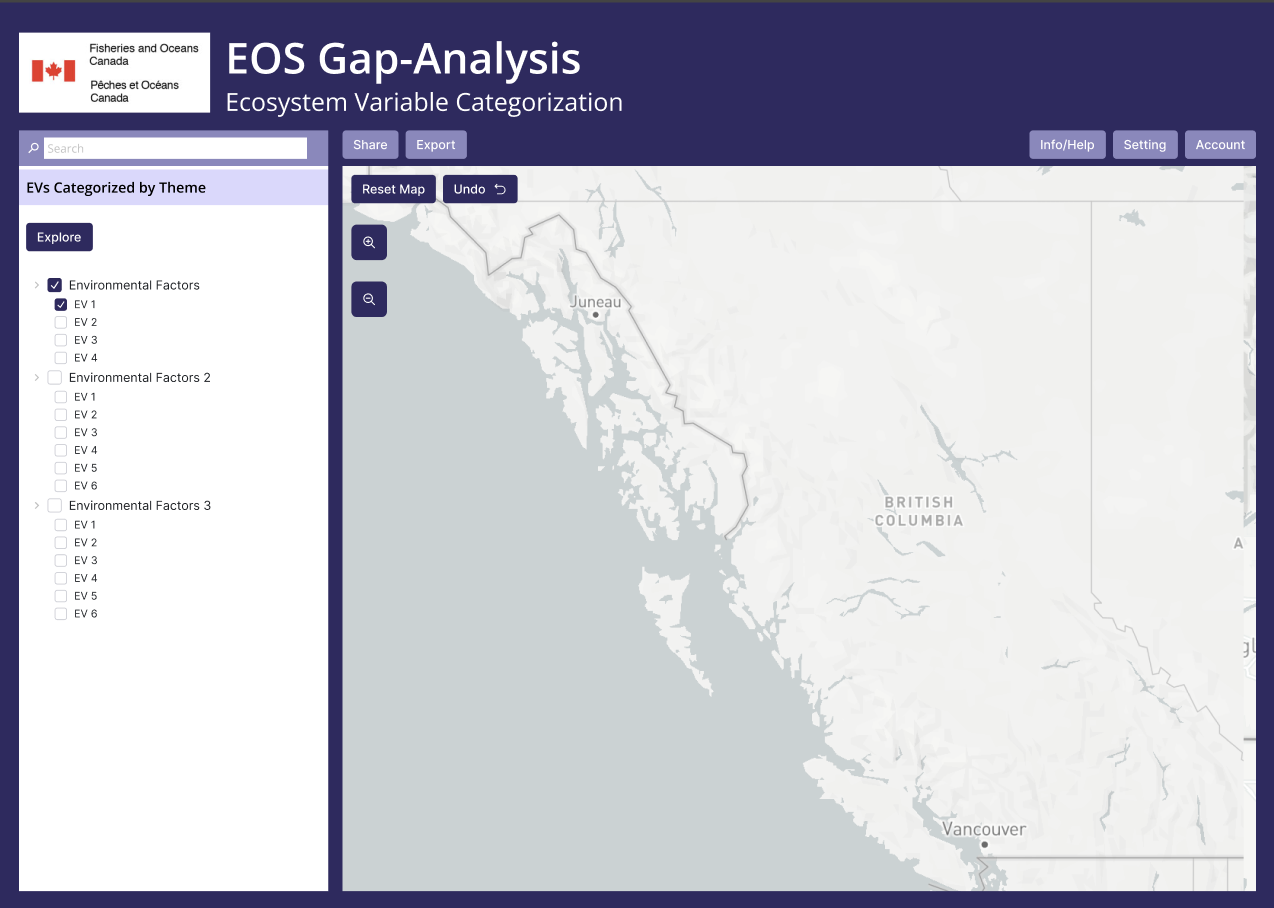
04. Advanced filtering + area selection
We introduced multivariable filtering and biogeographic region screening, along with the ability to select custom areas directly on the map (draw/marker). This addressed feedback that it was difficult to isolate the “data that actually matters” when filters were too limited or too rigid.
Impact: Faster narrowing, less manual scanning, more control over scope.
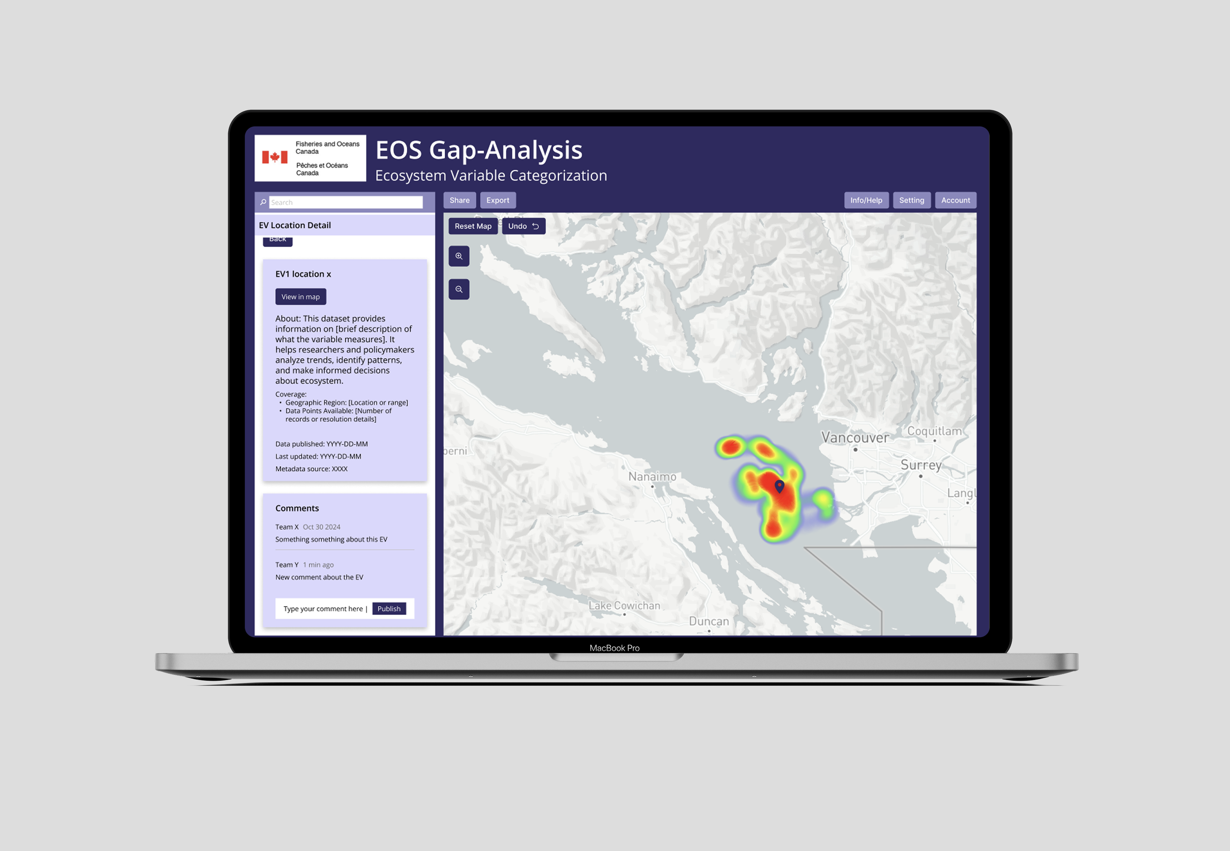
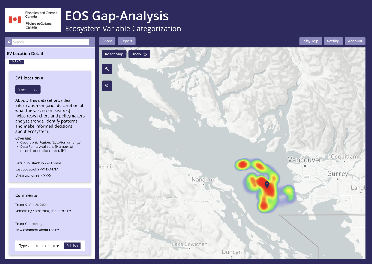
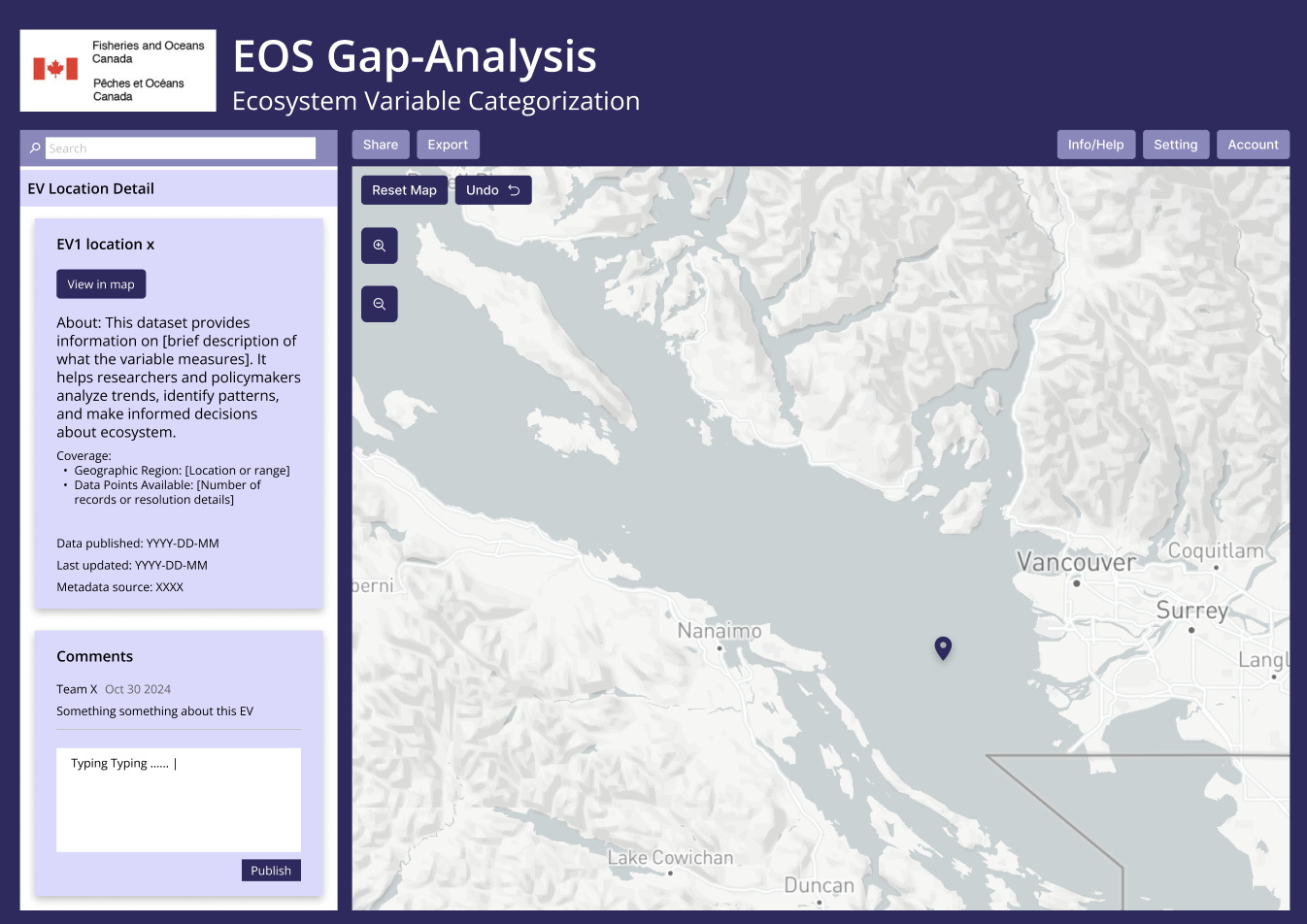
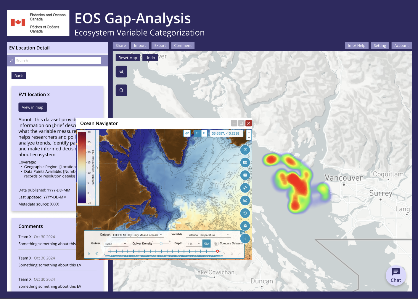
05. Heatmap + higher-resolution spatial analysis
To make gap analysis actionable, we added a heatmap layer that uses gradients to reveal density and sparsity. Hover interactions reveal statistical detail (bar chart), helping users interpret what the visualization represents. Zoom controls support finer analysis, aligning with scientific precision needs.
Impact: Users can quickly identify strong vs. weak coverage areas and validate what the map is showing.
06. In-context collaboration: comments + share links
Instead of pushing discussion into email/Teams, the redesign supports:
Dataset-linked comments in the dashboard
Shareable dataset links to streamline collaboration with internal and external stakeholders
Impact: Collaboration becomes contextual, searchable, and tied to the data being discussed.
Outcome
The redesigned EV Dashboard was delivered to the Fisheries and Oceans Canada team and is currently used as a reference model for improving data discovery and gap analysis workflows. Stakeholders have used the prototype to explore filtering logic, spatial visualization improvements, and metadata transparency enhancements within a Power BI constrained environment.