
MyFitnessPal Redesign
Calorie and Step Tracking App
Simplifying nutrition tracking for clarity, consistency, and beginner usability
Role
UX / Product Designer
Team
Solo Project
(for fun)
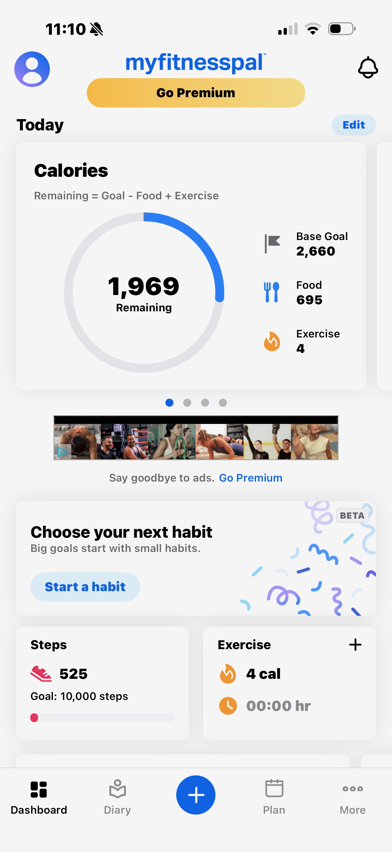
Current
Redesign
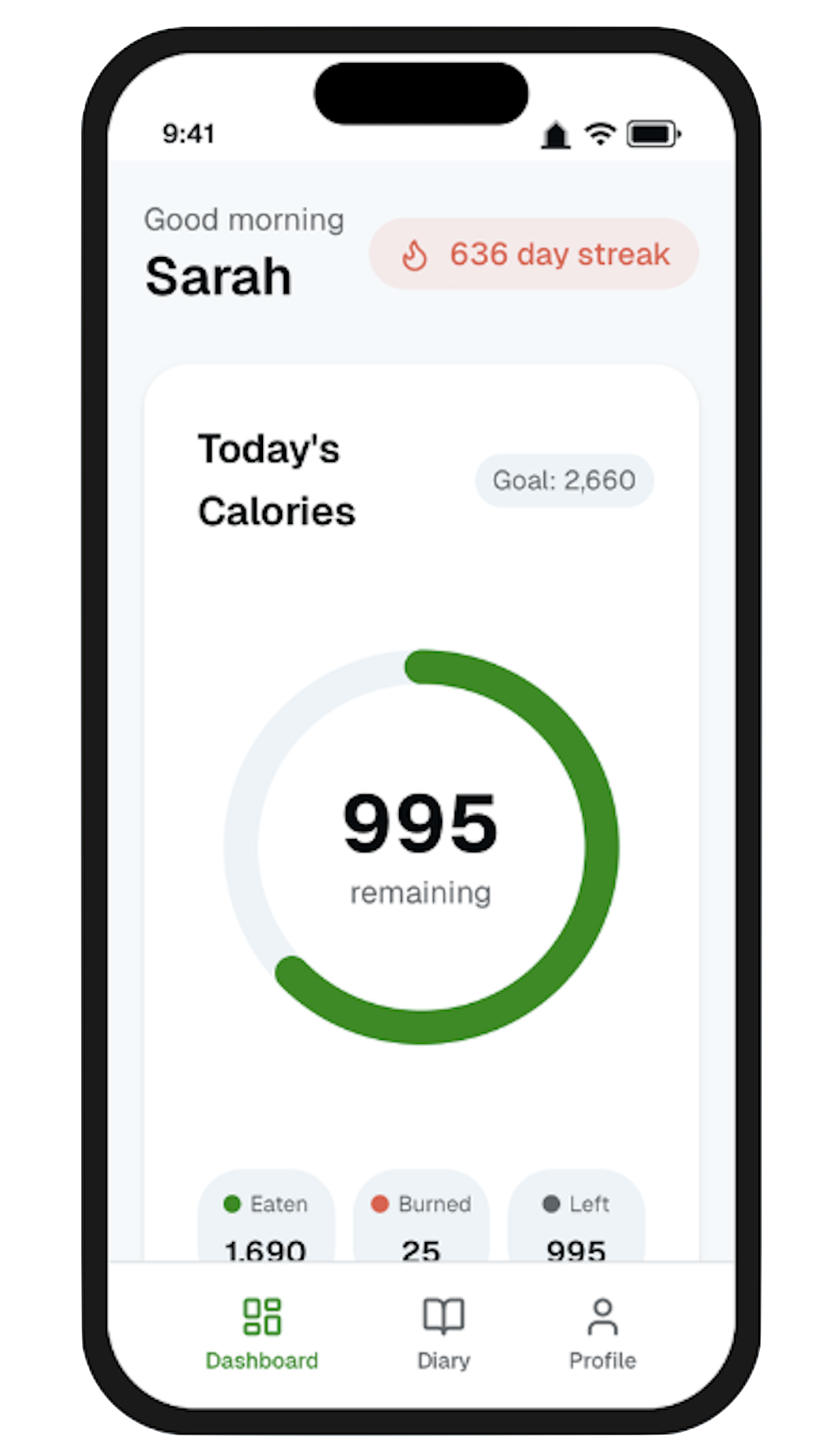
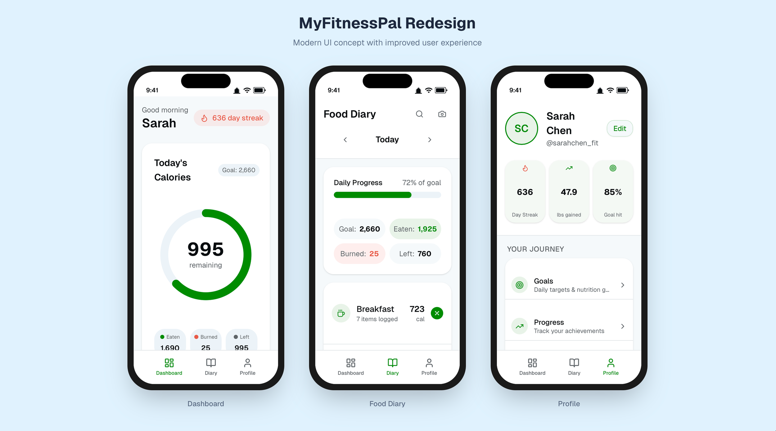
Pictured above: Current Home Screen (left) and Redesign (right)
01. Overview
MyFitnessPal is one of the most widely used nutrition tracking apps, but its interface can feel overwhelming, especially for new users trying to build consistent habits. This project focused on redesigning key screens to improve clarity, reduce cognitive load, and create a more intuitive daily tracking experience.
The goal was not to reinvent the product, but to simplify and restructure the experience so users can quickly understand their progress and stay consistent.
02. The Problem
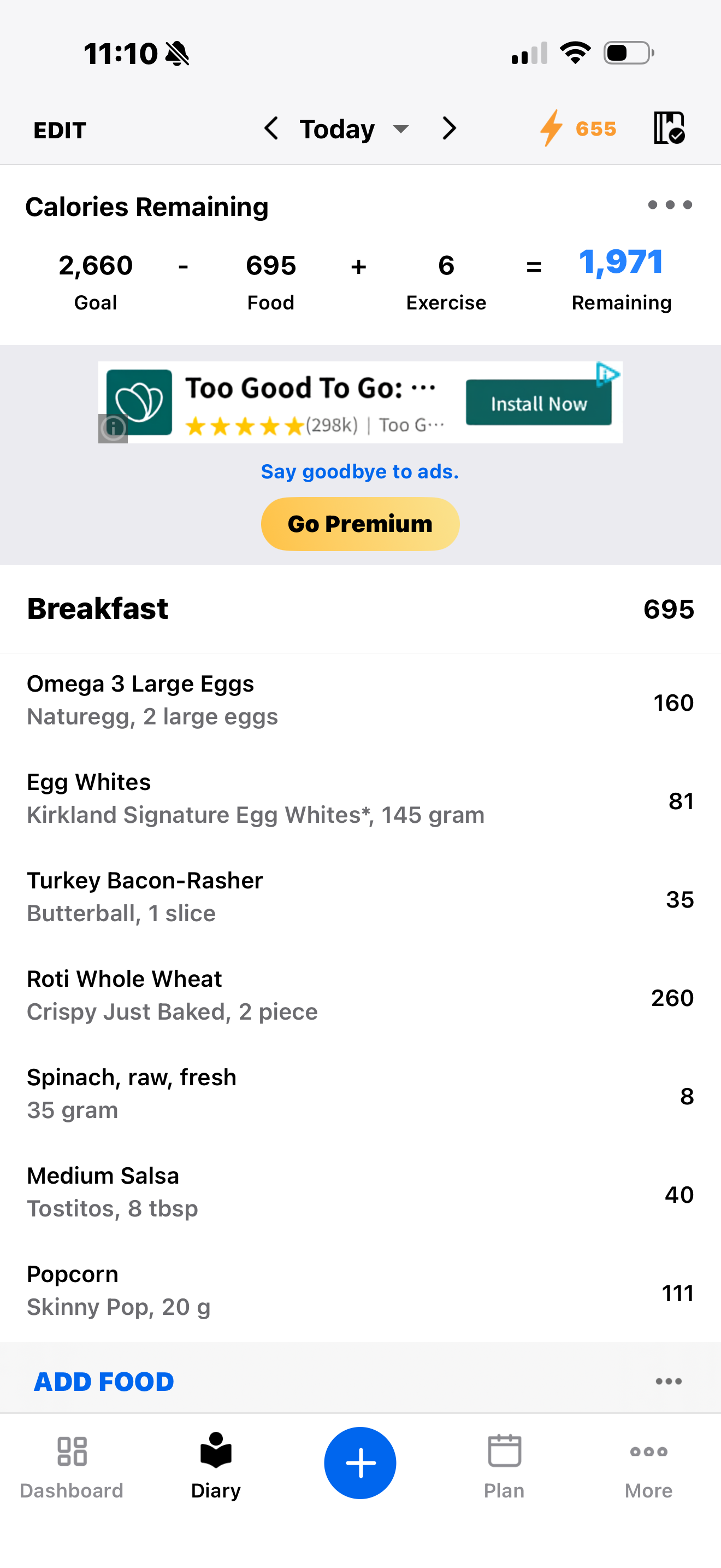
Despite its depth and functionality, MyFitnessPal often presents too much information at once. The interface relies heavily on numbers and text, with limited visual guidance, making it difficult for users to quickly interpret their progress. Key interactions such as logging food or understanding calorie balance require effort to decode, especially for beginners. On top of this, cluttered layouts, excessive menu options, and intrusive ads create unnecessary friction during what should be a simple, repeatable daily task.
03. Design Approach
The redesign was guided by a focus on clarity, structure, and usability. I aimed to reduce cognitive load by simplifying layouts, improving visual hierarchy, and replacing complex calculations with more intuitive visual feedback. At the same time, I wanted to maintain the depth of the product while making it feel more approachable, particularly for users who are just getting started.
Current
change copy here
Redesign
04. Dashboard
The dashboard was redesigned to give users an immediate and clear understanding of their daily progress. Instead of relying on dense information, the interface now centers around a simplified calorie tracker that highlights what matters most, being how many calories remain. Supporting information, such as calories eaten and burned, is still present but presented in a cleaner, more digestible format. Additional elements like step tracking, exercise summaries, and weekly progress trends are surfaced in a way that supports motivation without overwhelming the user.
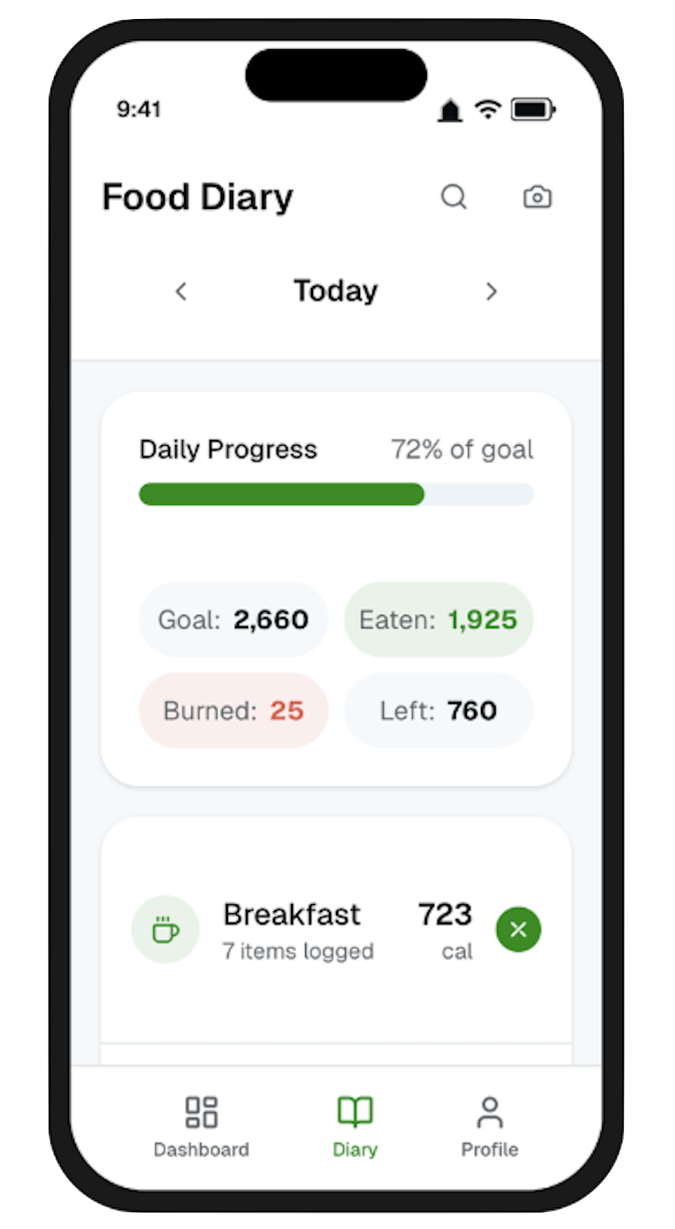
05. Food Diary
The food diary, which is the most frequently used part of the app, was restructured to feel more organized and easier to navigate. The original calorie equation was replaced with a visual progress system that allows users to understand their intake at a glance. Meals are clearly separated into sections such as breakfast, lunch, dinner, and snacks, with the option to collapse sections to reduce visual clutter. Food entries are simplified to show only the most relevant information, while features like barcode scanning and quick add are made more prominent to speed up logging. Removing distractions such as ads also helps create a more focused experience during use.
06. Profile
The profile experience replaces the previously cluttered “More” menu with a more structured and intentional layout. Instead of presenting users with a long list of options, features are grouped into clear categories that reflect how users think about their journey, nutrition, and settings. Key stats are surfaced at the top, while the number of menu items is reduced to focus only on what’s essential. This makes navigation more predictable and reduces the effort required to find specific features.
Outcome
The redesign demonstrates how simplifying structure and prioritizing visual clarity can significantly improve the usability of a data-heavy application. By reducing clutter, improving hierarchy, and introducing more intuitive feedback systems, the experience becomes easier to understand and more approachable, particularly for new users. The project highlights how thoughtful UX decisions can transform a powerful but overwhelming product into a more focused, habit-supporting experience.