Fisheries and Oceans Canada · Government of Canada
Gap Analysis Dashboard
Restructuring a data-heavy research platform so scientists and government stakeholders can explore, compare, and interpret complex ecosystem data.
Context
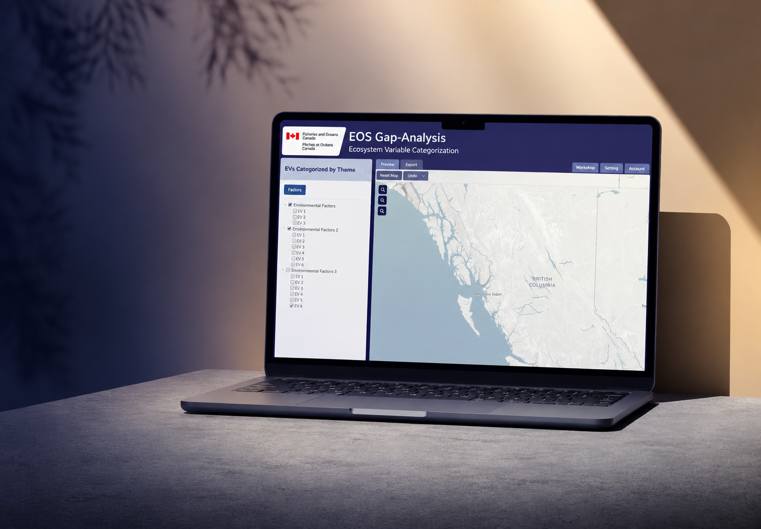
A research platform for ecosystem data
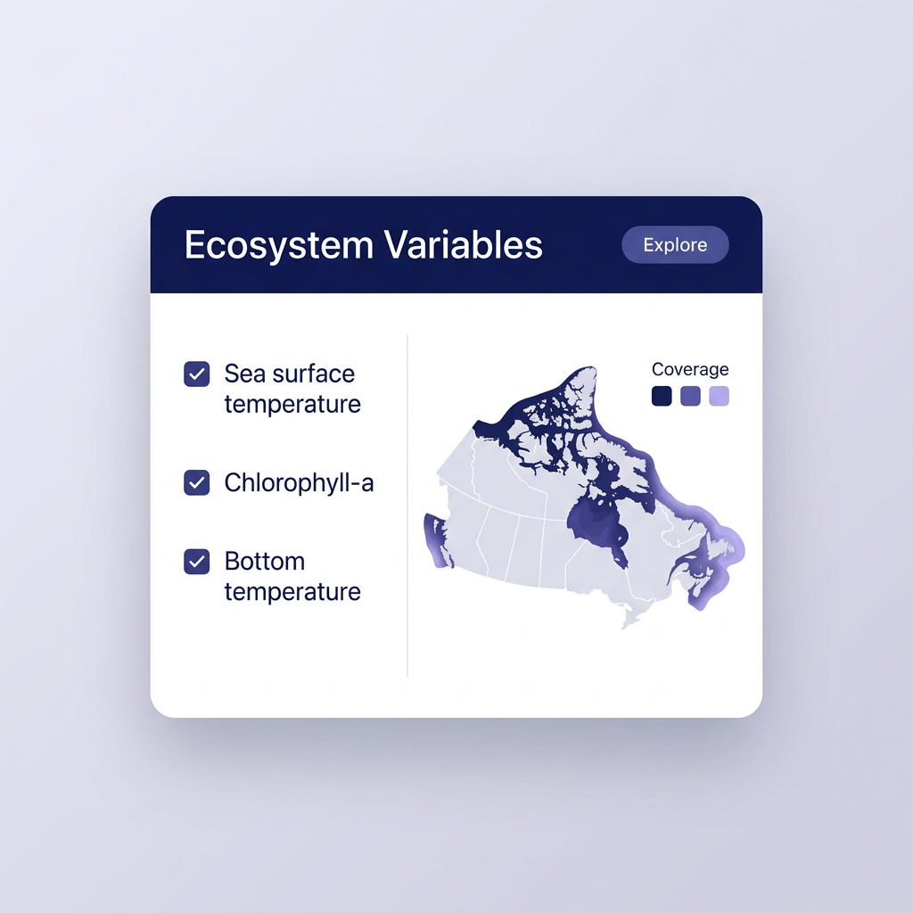
DFO scientists use an internal Ecosystem Variables dashboard to see where marine data coverage is strong and where gaps remain. During a four-month co-op, I redesigned the path from first login to finding a variable, reading its coverage, and sharing a finding.
The Problem
Expert users, no clear path through the data
Variables, a map, and results were all exposed at once with nothing connecting them. Users knew what they needed, but not where to find it.
My Role
What I owned
As UX/UI designer, I ran usability testing, restructured the information architecture, and designed filtering, navigation, data detail, and onboarding with researchers and stakeholders.
Research / What I Learned
Where the experience was breaking down
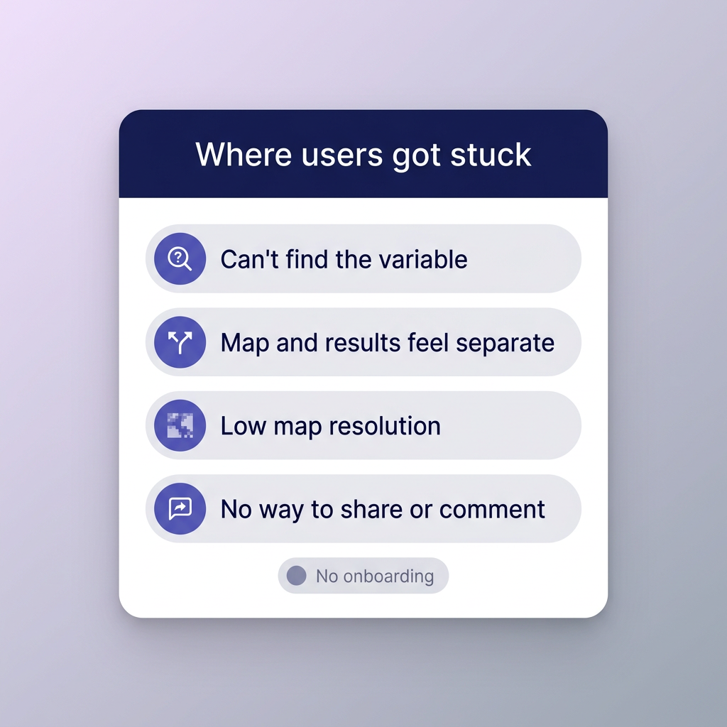
Interviews and usability sessions with data analysts showed how they search, interpret, and share ecological data.
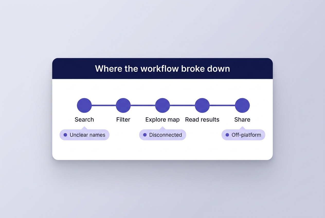
Four patterns behind every later decision
01
Finding variables
Users did not know where to start.
02
Disconnected workflow
Navigation, map, and results felt like separate steps.
03
Too much at once
Complexity was exposed up front.
04
Trust in the data
Experts needed source and timestamps.
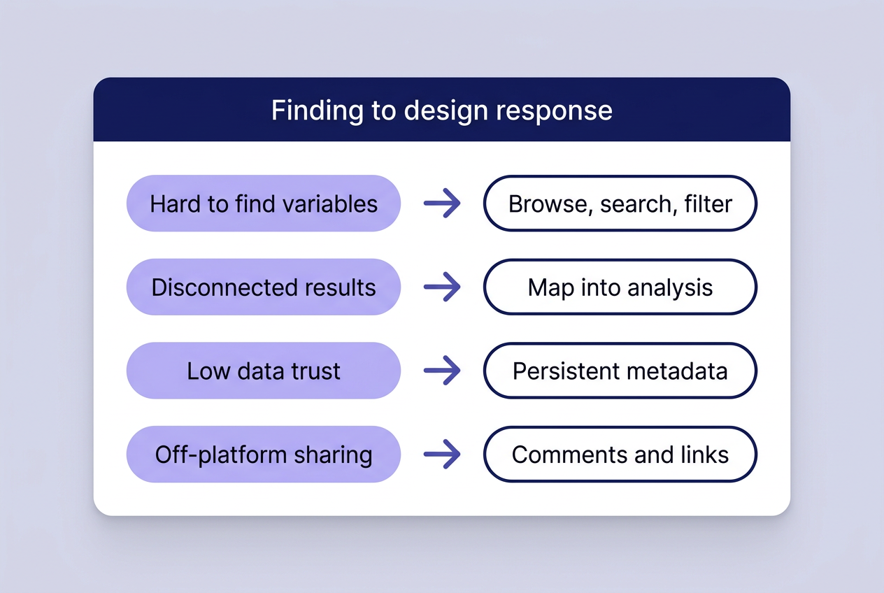
Finding → Design Response
From research findings to design decisions
Information Architecture
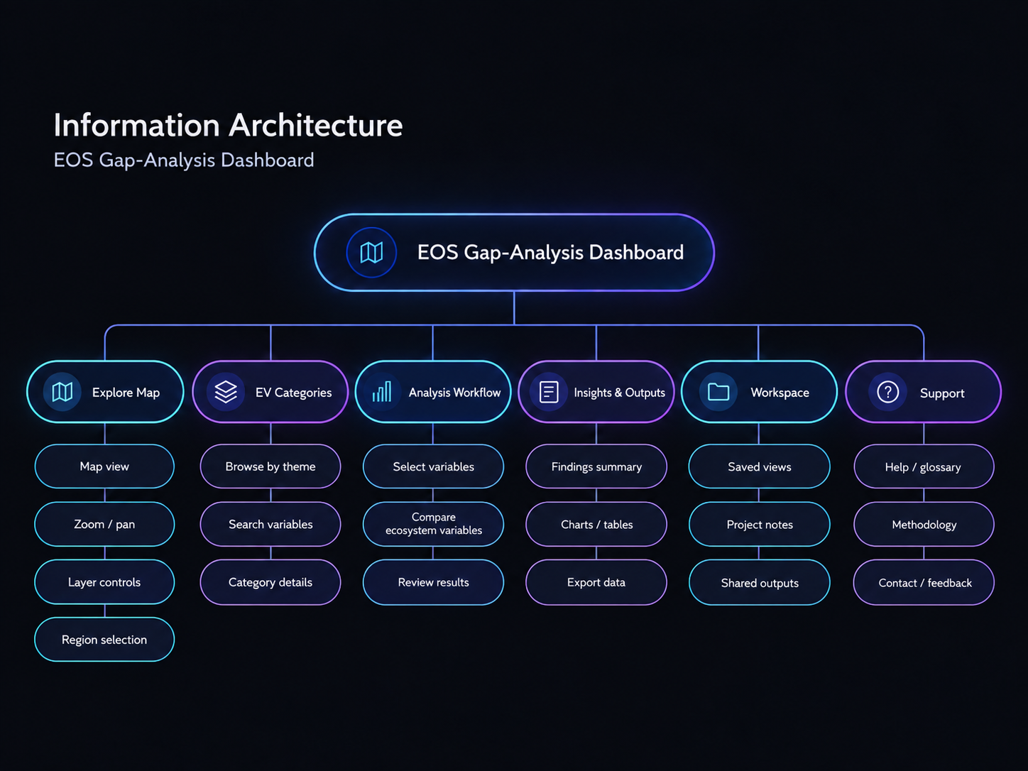
Restructuring the platform around how researchers work
Before touching any screen, I reorganized the product into six areas, each with one clear job.
Iterations & Trade-offs
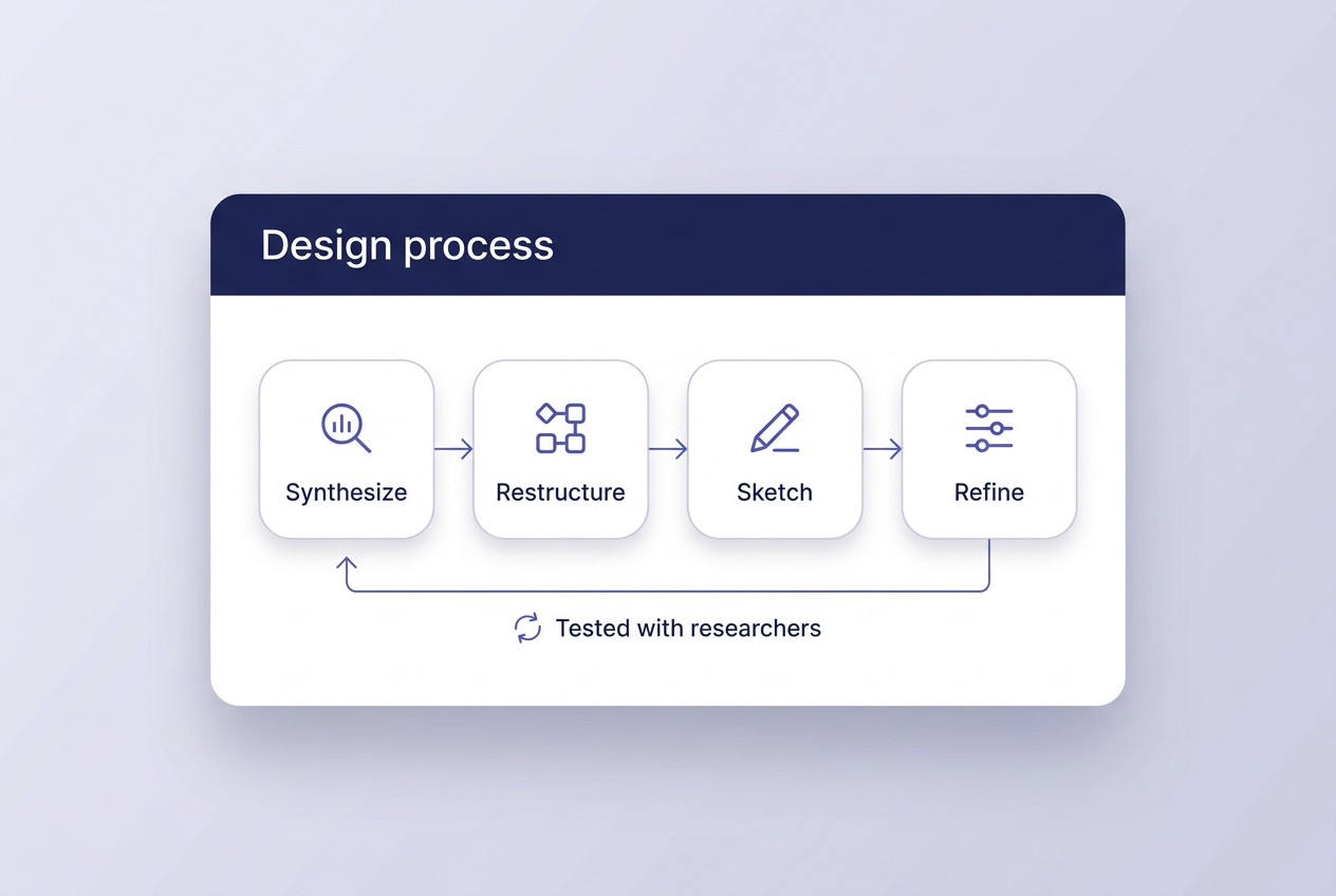
Balancing flexibility with clarity
Each stage was tested with researchers before the next began, so depth of control never cost a readable path.
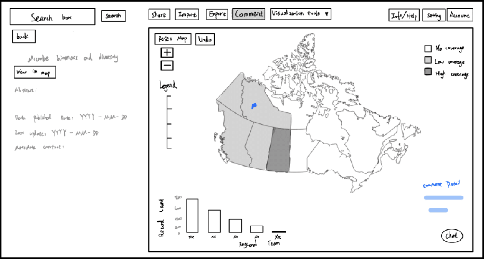
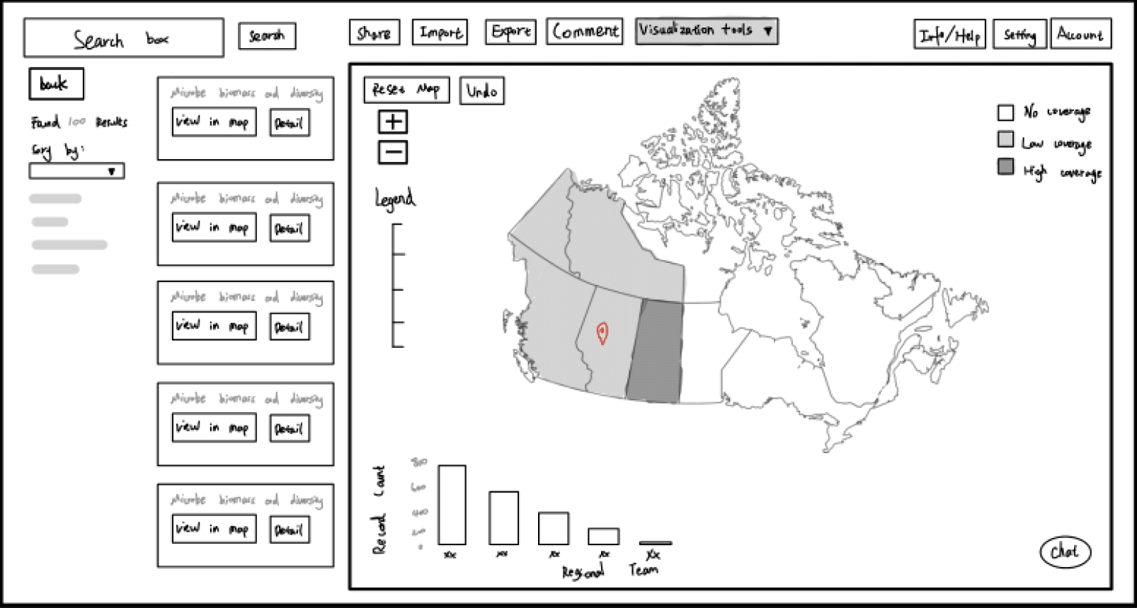
Testing structure before visual detail
Low-fidelity wireframes tested navigation, the map, and onboarding before any visual detail.
Final Experience
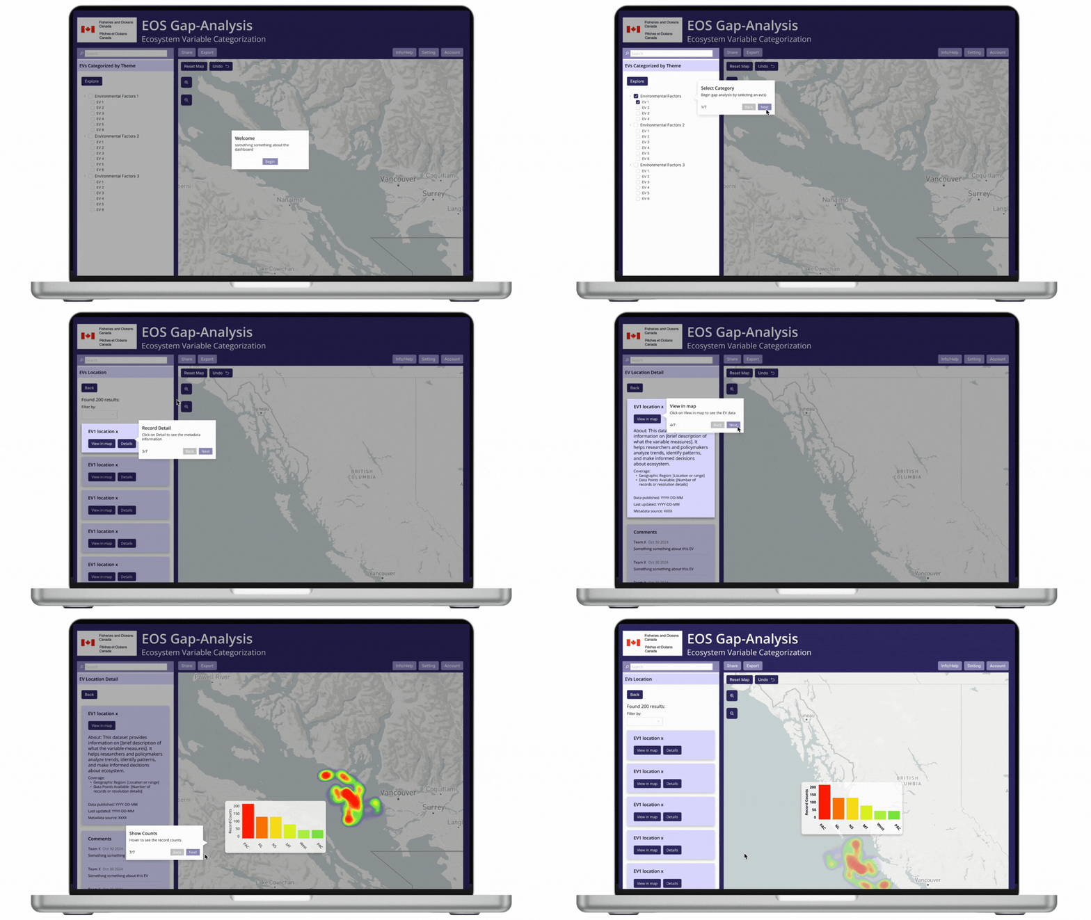
A clearer path from exploration to analysis
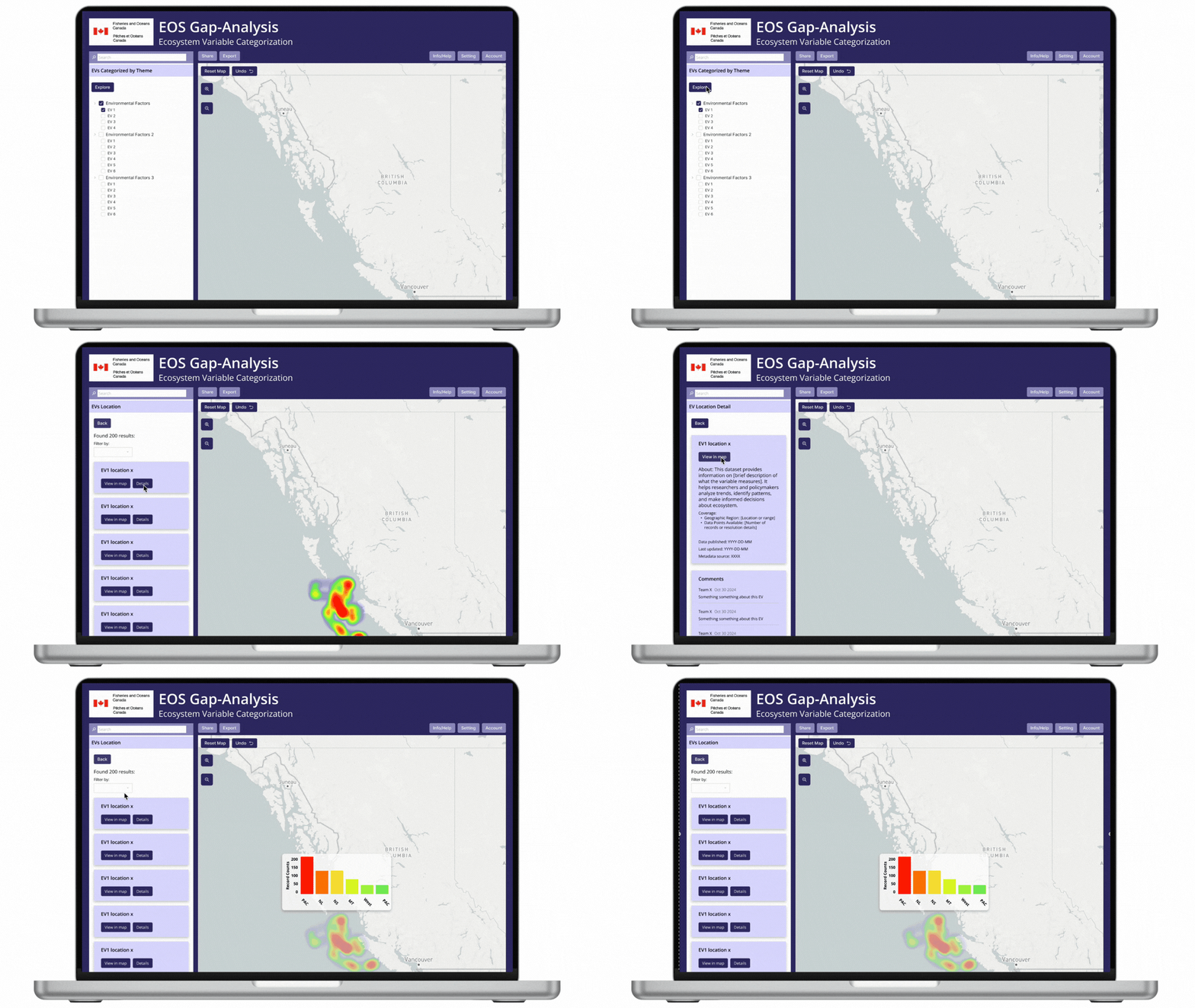
Experts keep precise control while the route through the platform stays obvious. Users filter by variable and biogeographic region, draw custom areas on the map, and read heatmaps at finer spatial detail.
- Filtering by variables and regions, with active filters always visible
- Higher-resolution heatmaps with zoom
- Metadata panel showing source, timestamp, and description
- Comments and shareable dataset links
- Guided onboarding for new users
Design System
Reusable patterns for a complex research platform
One component library sits under every screen, built on the departmental indigo, a light lavender panel tone, and white data surfaces. Inputs, controls, filters, navigation, and data displays now share the same rules, so new features start from a tested base.
Dataset search
Inputs: a persistent field for finding a variable by name or code.
Button hierarchy
Controls: primary, secondary, and tertiary actions with one emphasis per view.
Checkbox states
Controls: unchecked, checked, mixed, and disabled states for the variable tree.
Filter tree
Navigation: collapsible theme groups that narrow results to specific variables.
Active filter tags
Filtering: removable chips that keep the current query visible.
Map coverage legend
Data display: a graduated scale for record density across the heatmap.
Regional distribution chart
Data display: record counts compared across biogeographic regions.
Data detail card
Data display: coverage, source, and publication dates that build trust.
Outcome & Impact
A stronger foundation for scientific exploration
The redesigned workflow gives researchers a clearer sequence through the data, rather than leaving them to piece it together themselves.
01
Findable variables
Categories, search, and filters are designed to give every ecosystem variable a clear route in.
02
One connected workflow
Navigation, map, and results are structured as a single path rather than three separate tools.
03
Readable coverage
Heatmaps, legends, and metadata are designed to show where data is strong, where gaps remain, and where it came from.
04
Less guesswork
Active filters, zoom, and onboarding reduce the need to already know the system.
Built to be extended
The new information architecture and design system give the team a stable base for future datasets and features. Advanced functionality only helps when both expert and non-technical users understand what the system is showing and what to do next.
As this was a Government of Canada project, a portion of the research, iteration, and stakeholder work sits behind confidentiality agreements with Fisheries and Oceans Canada and isn’t shown here.