Mobile product design

Major Meal Manager

An all-in-one tool that helps people curate, organize, shop for, and cook multi-course meals.
Roles

Research, Product Design, UX/UI Design, Wireframing, Prototyping

Team

Aaron Cappuccio

Timeline

February – April 2024 70 hours

Tools

Figma · Illustrator

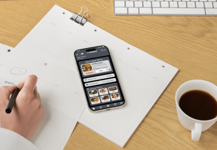
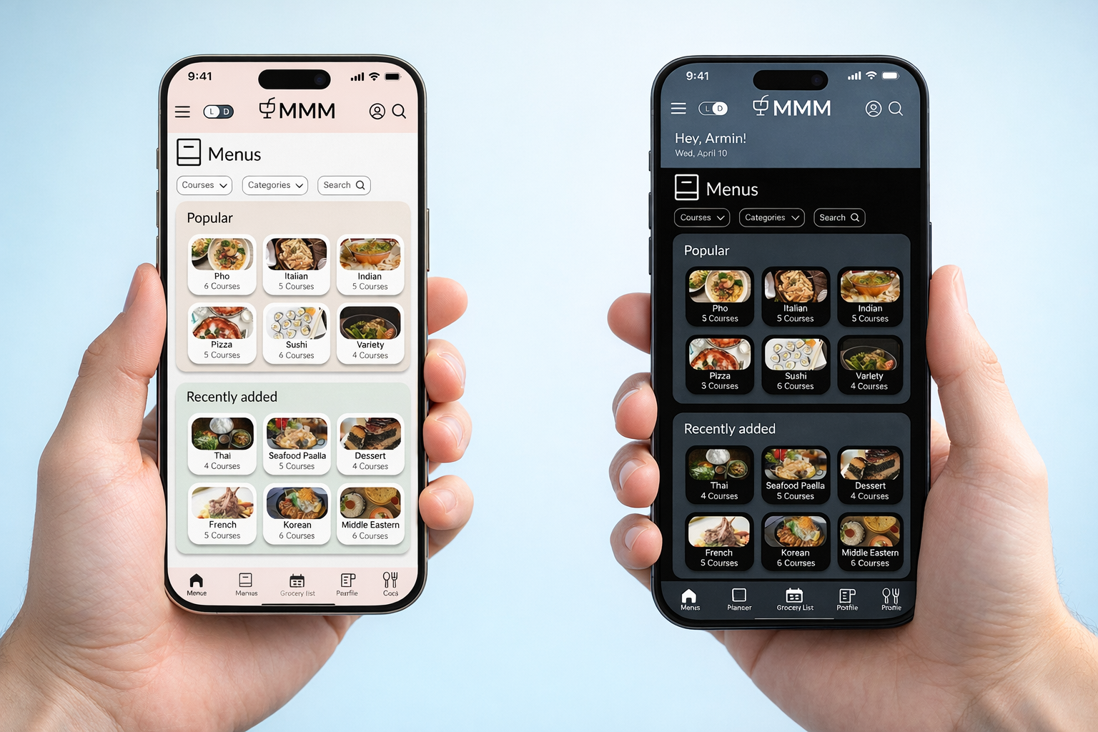
Major Meal Manager interface overview

Context

Project brief

This project focused on designing a mobile application from the ground up to solve a specific user problem for a niche audience. The goal was to define a clear product concept, map out a structured user flow, and create a high-fidelity interface that follows mobile design best practices. The final outcome was an interactive prototype supported by a cohesive design system, demonstrating thoughtful decisions in usability, accessibility, and visual design.

Desk setup with a notebook, laptop, and sketches used to plan the Major Meal Manager concept

The problem

Cooking multi-course meals is mentally demanding. Users must juggle recipes, ingredient quantities, timing, and preparation steps across multiple apps, notes, or printed recipes. Existing meal-planning tools primarily focus on planning, but offer limited support once users enter the kitchen.

Research & Discovery

Competitor analysis

To understand the current landscape, I analyzed platforms such as Tasty: Recipes & Cooking Videos, and Yummly Recipes & Meal Planning. These apps support meal planning and recipe discovery in different ways, but they are primarily centered around individual meals or recipes, rather than full multi-course experiences. While effective for basic planning, they present several limitations:

  • Lack of structured multi-course meal planning
  • Limited coordination between multiple dishes
  • Minimal support for timing and preparation flow
  • Fragmented experience between planning, shopping, and cooking

While these platforms are useful for everyday meal tracking or discovery, they do not support the complexity of planning and preparing a complete, multi-course meal.

This revealed a clear gap: there is no integrated solution that enables users to plan, organize, and execute multi-course meals within a single, cohesive workflow.

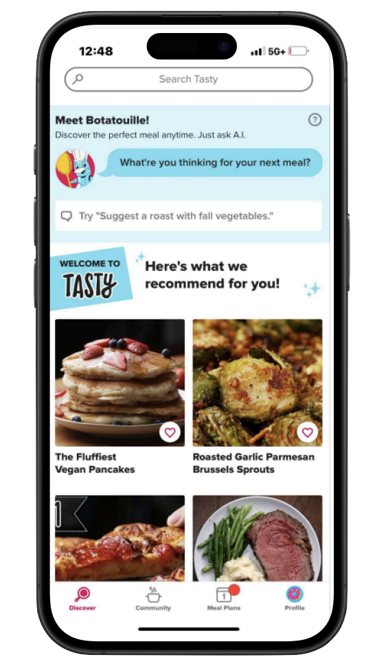
Tasty: Recipes & Cooking Videos

Screenshot of the Tasty app recipe discovery screen with the Botatouille AI assistant

Offers a large library of recipes with step-by-step video guides. It excels in content discovery and ease of use but lacks structured meal planning or organizing multiple dishes into a cohesive menu.

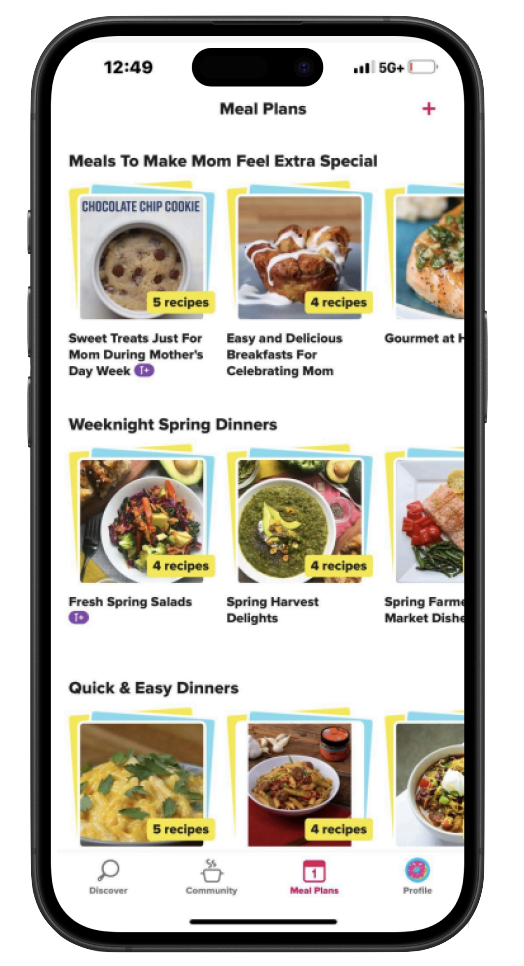
Yummly Recipes & Meal Planning

Screenshot of a meal-planning app showing saved weekly meal plans grouped by theme

Provides personalized recipe recommendations and meal planning tools. While more advanced in planning than other apps, it still treats meals as individual recipes and lacks features for managing timing, structure, and preparation across multiple courses.

Key challenges identified

01

High cognitive load

High cognitive load during meal preparation and active cooking.

02

Fragmented workflows

Fragmented workflows between planning, shopping, and cooking.

03

Context switching

Frequent context switching between resources including recipes and tools.

Prototype

Home Page

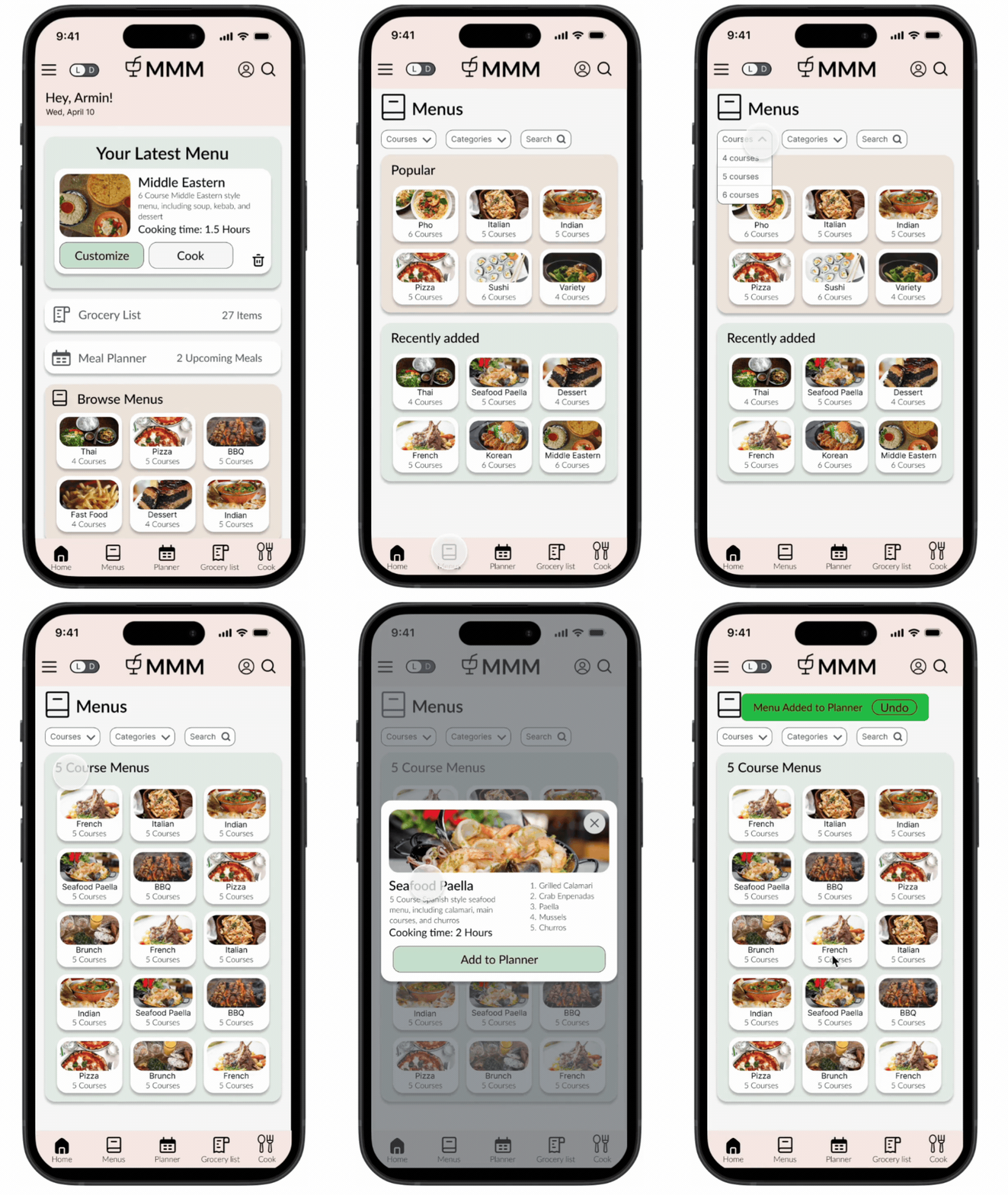
The Home Page acts as a central hub with quick access to the grocery list, meal planner, and recently saved menus. A preview section surfaces popular menus so users can resume planning or find inspiration without friction.

Menu Browsing

Curated menus of 4–6 courses are organized by culture and cuisine in a clean browsing interface. Filters for name, cuisine, theme, and occasion sit at the top of the screen, with search available for users who already know what they want.

Add Menu to Planner

Adding a menu to the planner works as both a save action and a planning step. Saved menus can be accessed, edited, or scheduled later, which spreads meal preparation over time instead of concentrating it in one session.

Animated walkthrough of the Home Page, Menu Browsing, and Add Menu to Planner screens
Pictured above: Homepage → Menu Browsing → Add Menu to Planner

Dark Mode Toggle

Dark mode supports the low-light conditions people actually cook in, reducing eye strain during extended use. Both themes were built to the same contrast standards so accessibility holds up in either mode.

Grocery List Consolidation

Ingredients from every selected menu aggregate into one organized list, with duplicates combined automatically. Items remain viewable inside their original menu for context, so shopping is efficient without losing traceability.

Cook Mode

Cook Mode gives in-kitchen use a focused, step-by-step view of the full meal. Users move through courses, switch between video and written instructions, and track timing without leaving the flow.

Animated walkthrough of viewing the grocery list, entering Cook Mode, and changing a recipe from tool to text
Pictured above (Dark mode): View Grocery List → Cook → Change Recipe from tool to text

Design System

Consistent in light, legible in the dark

Contrast Grid

This contrast grid was created to evaluate and validate the accessibility of the MMM colour system across a wide range of background and text combinations. Using WCAG contrast values, it systematically tested each pairing to ensure legibility at scale. The grid highlights which combinations meet AA and AAA standards, and flags those that do not pass WCAG. By visualizing contrast performance in a single matrix, I was able to establish clear guidelines for when and how each color combo could be used: for accessible body text, UI elements, and emphasis states. This not only improved accessibility consistency but also brought consistency and confidence to the overall visual system.
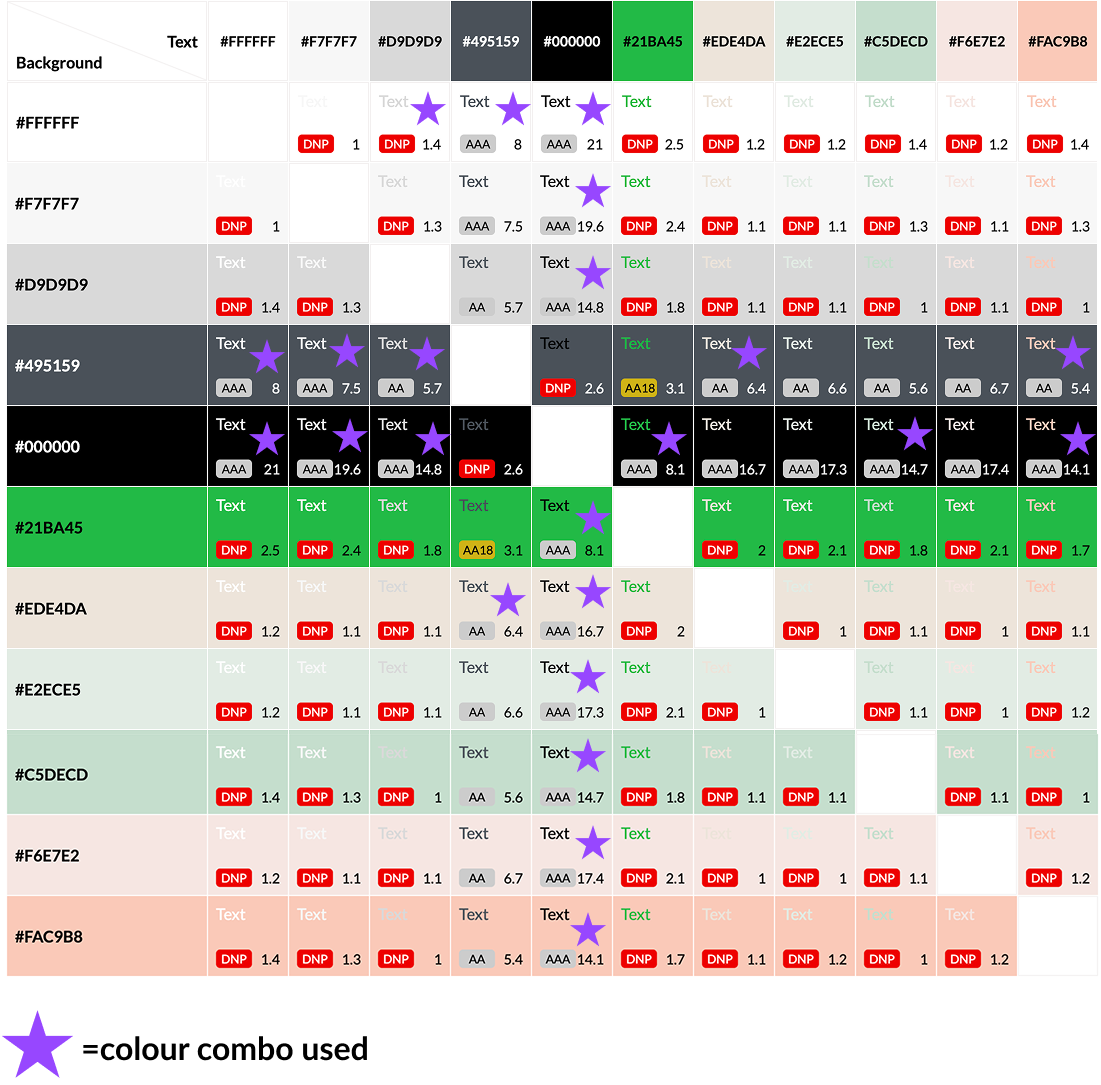
Color and contrast grid used to validate legibility across light and dark themes

Light and Dark Components

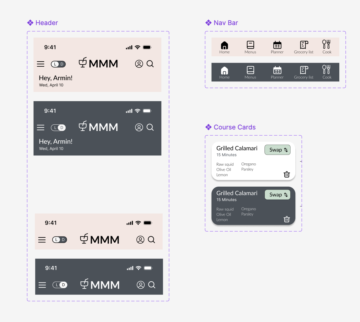
To ensure consistency and scalability across MMM's light and dark modes, I developed a comprehensive set of Figma components that support both usage cases. Core interface elements including the bottom navigation bar, key interactive components like buttons and cards would be reusable, variant-based components, and each element allow for attribute states such as hover, active, and disabled, as well as contrast and legibility across themes. This system not only streamlined the design process and reduced redundancy, but also created a flexible foundation for future expansion, ensuring the interface remains cohesive as new features are introduced.

Component library showing cards, navigation, and buttons in both light and dark mode

Key Takeaways

Workflow-Driven Design

This project demonstrated how structured workflows can simplify complex tasks like planning and preparing multi-course meals. By guiding users through a clear sequence-from menu selection to cooking-the design reduces cognitive load and helps keep users focused throughout the experience. It reinforced the importance of breaking down complex, real-world tasks into manageable steps.

Integrated User Experience

Designing Major Meal Manager (MMM) highlighted the value of consolidating multiple tools into a single cohesive system. By integrating menu planning, automated grocery lists, and guided cooking instructions, the experience minimizes context switching and keeps users organized. This approach emphasizes how thoughtful integration can enhance usability and create a more seamless end-to-end experience.

Next project

TranslatR