

MyFitnessPal Redesign
Simplifying nutrition and daily activity tracking for clarity, consistency, and beginner usability
Roles
Research, Product Design,
UX/UI Design, Wireframing, Prototyping
Product Overview
Team
Aaron Cappuccio
Timeline
January 2026
Hours Contributed: 10
Tools
Figma
V0
Project Brief
This project focused on redesigning key screens of MyFitnessPal to improve usability for beginner users. While the app is powerful, its current experience can feel overwhelming and data-heavy, especially for people just starting their fitness journey. The goal was to simplify the interface, clarify key information, and create a more supportive, intuitive experience.
The Problem
MyFitnessPal provides a wide range of features, but its interface often prioritizes data density over clarity. New users can struggle to understand what matters, where to start, and how to interpret their progress.
Goal
Design a cleaner, more beginner-friendly experience that:
Prioritizes clarity over complexity
Highlights key actions and insights
Reduces cognitive overload
Makes tracking feel approachable and motivating
Context
Research & Discovery
User Reviews
App Analysis
Through reviewing the existing app and analyzing user pain points, a few key issues stood out:
Information overload: Too many numbers and sections competing for attention
Unclear hierarchy: Important metrics (like calories remaining) don’t stand out enough
High friction for beginners: Users need to “learn” the interface before using it
Lack of guidance: The app assumes prior knowledge of tracking and fitness concepts
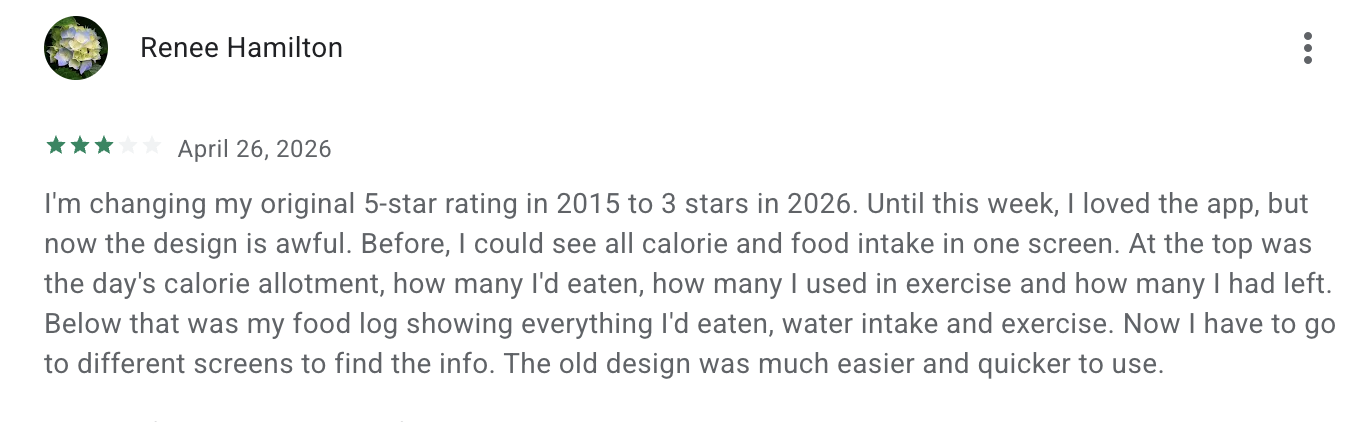
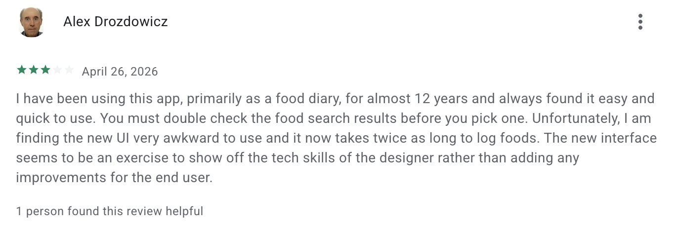
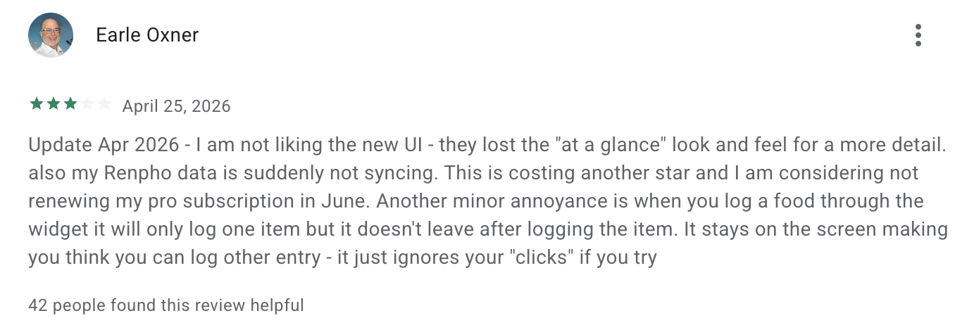
User Reviews Summary
Recent user reviews highlighted a consistent frustration with the updated MyFitnessPal interface, particularly among long-time users.
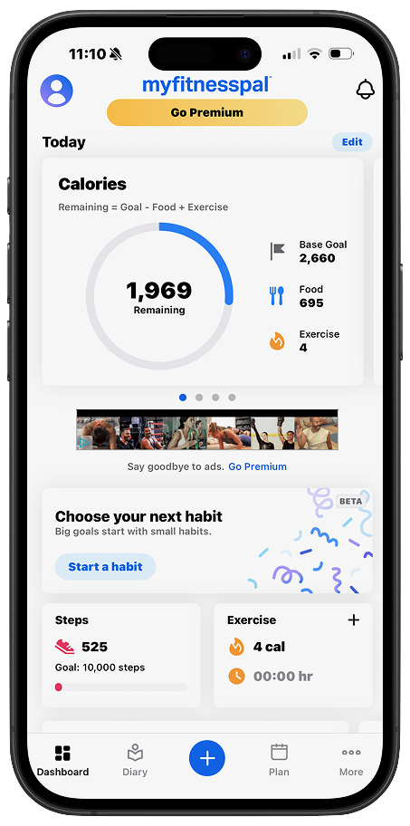
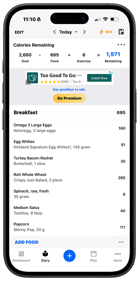
A major theme was the loss of the app’s “at-a-glance” usability. Previously, users could view their calorie budget, intake, exercise, and food log all in one screen. The new design spreads this information across multiple screens, increasing friction and making the experience feel slower.
Many users also noted that logging food now takes longer, with a more complex flow and less intuitive navigation. What was once quick and efficient now requires additional steps and more effort.
There was also a perception that the redesign prioritized visual changes over usability improvements, leading to an interface that feels less practical for everyday use.
Overall, the feedback suggests that while the app evolved visually, it regressed in efficiency, clarity, and ease of use, especially for its core function as a daily tracking tool.
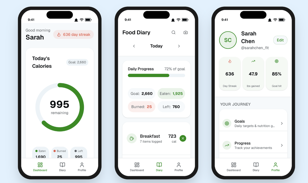
Structured Data Breakdown
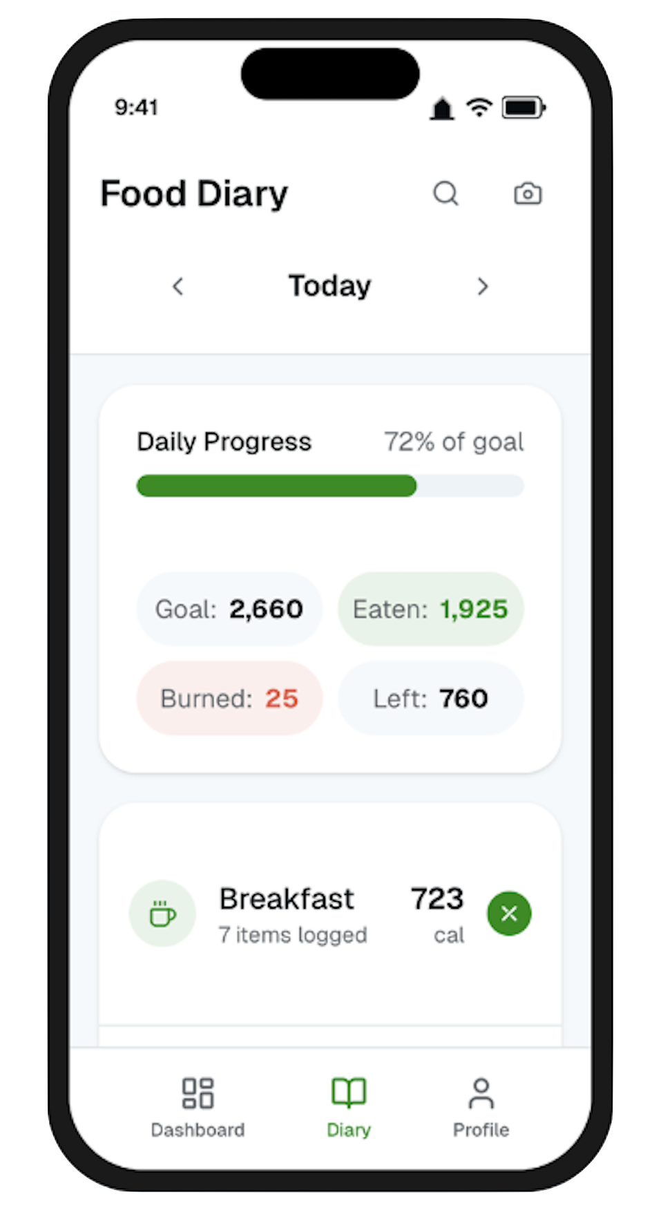
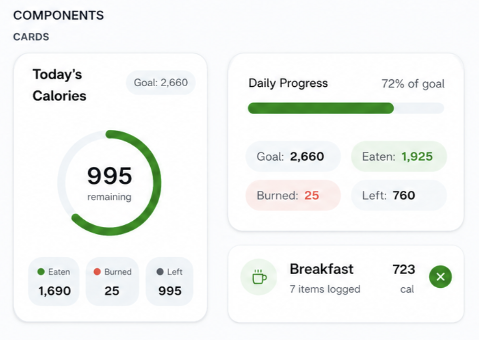
Instead of overwhelming users with raw numbers, nutritional data is organized into digestible, labeled blocks (Goal, Eaten, Burned, Left). This makes the relationship between values easier to understand without requiring prior knowledge of calorie tracking.
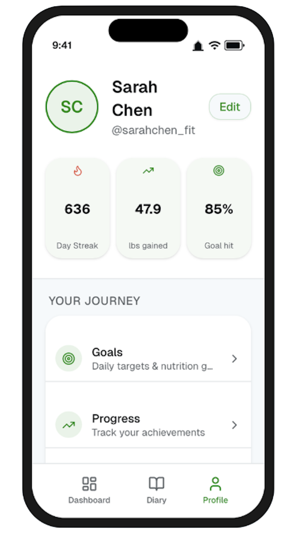
Profile as a Progress Hub
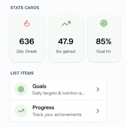
The profile screen shifts from a static settings page to a personal progress hub. Key stats like streaks, goal completion, and weight changes are displayed as visual cards, helping users reflect on long-term progress in a simple, rewarding way.
Simplified Food Diary
The food diary was redesigned to prioritize speed and scannability. Meals are grouped into clean, card-based sections with clear calorie totals and item counts, allowing users to quickly review their day. Key actions like adding or removing items are more accessible, reducing friction in the logging process.
Prototype
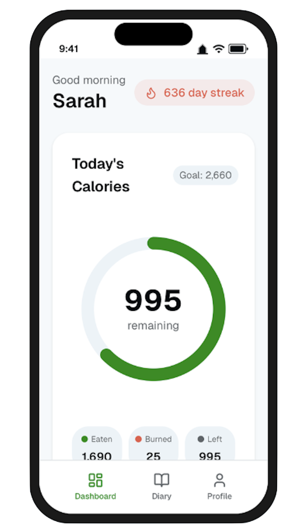
Guided Daily Progress
A clear progress system reinforces daily goals through both circular and linear indicators. These visual cues reduce the need for mental calculation and help users quickly interpret how close they are to their targets, making the experience more intuitive and motivating.
Dashboard
The dashboard centers around a single, highly visible calorie ring, allowing users to instantly understand their daily status. Instead of scanning multiple numbers, users see what matters most, calories remaining supported by a simple breakdown of eaten, burned, and remaining values. This restores the quick, one-screen understanding that many users felt was lost.
Design System
To support consistency and scalability across the redesign, I developed a lightweight design system focused on clarity, hierarchy, and ease of use. The system is built from reusable components that simplify complex data while maintaining a cohesive visual language.
Core Components
Progress Indicators
The system uses both circular and linear progress elements to communicate information at different levels. The calorie ring acts as the primary focal point for daily tracking, while progress bars provide quick, secondary feedback on goal completion.Card System
A flexible card-based layout is used across all screens to group related information. From calorie summaries to meal logs, cards create clear separation, improve scanability, and reduce cognitive overload.Stat Blocks
Key metrics (Goal, Eaten, Burned, Left) are broken into structured stat blocks with subtle color coding. This allows users to quickly understand relationships between values without needing to interpret raw data.List & Meal Items
The diary experience is built around modular list components, where each meal is treated as a distinct unit. These include clear labels, calorie totals, and quick actions, making logging and reviewing food fast and intuitive.
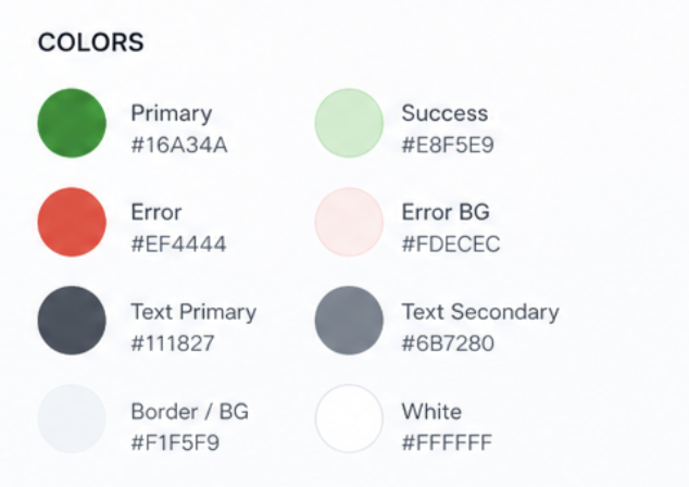
Color
The color system is designed to be functional rather than decorative, using color to communicate meaning and guide attention.
Green is used as the primary action and success color, representing progress, completion, and positive feedback (e.g., calories remaining, active states).
Red is used sparingly to indicate negative or subtractive values, such as calories burned, ensuring it stands out without overwhelming the interface.
Neutral tones (light greys and off-whites) form the foundation of the UI, creating a clean background that allows key information to stand out.
This restrained palette helps reduce visual noise while making important data immediately recognizable.
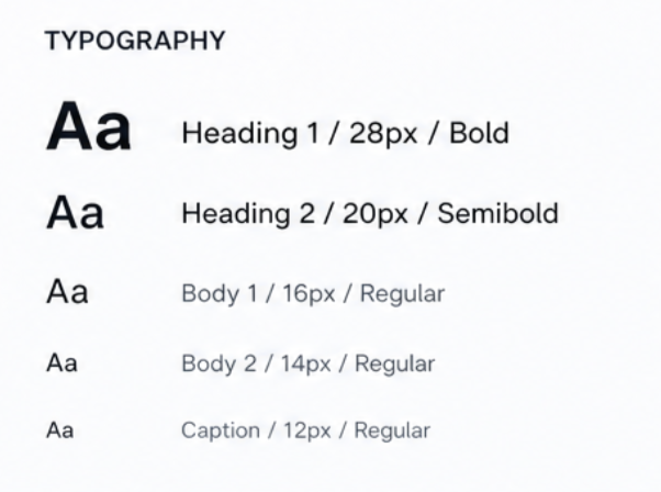
Typography
The typography system emphasizes readability and hierarchy, especially in a data-heavy interface.
Larger, bold text is used for primary metrics (e.g., calories remaining) to draw immediate attention.
Medium-weight text is used for section headings and labels, providing structure without competing with key data.
Smaller, lighter text supports secondary information such as descriptions and metadata.
The overall approach ensures users can quickly scan and understand information without feeling overwhelmed.
This project reinforced the importance of designing for clarity and efficiency in data-heavy experiences. Through simplifying navigation, strengthening visual hierarchy, and prioritizing key information, I learned how small UX decisions can significantly impact usability and user satisfaction.
The redesign also highlighted the value of balancing modern visual design with functional usability, especially for long-time users who rely on speed and familiarity in everyday interactions.