AI bootcamp challenge · 1 hour
MyFitnessPal Redesign
A rapid, intentionally unpolished redesign built in under an hour to test what I could create with AI-assisted tools.
Context
Project brief
This was an AI bootcamp challenge: a one-hour experiment to see what I could create with AI-assisted tools. I explored a quick redesign of key MyFitnessPal screens to improve clarity for beginner users. It is intentionally not a polished, production-ready case study; the value is in testing the speed, direction, and possibilities of the process.
The problem and goal
MyFitnessPal provides a wide range of features, but its interface can prioritize data density over clarity. New users can struggle to understand what matters, where to start, and how to interpret their progress.
- Prioritize clarity over complexity
- Highlight key actions and insights
- Reduce cognitive overload
- Make tracking feel approachable and motivating
Research & Discovery
User reviews and app analysis
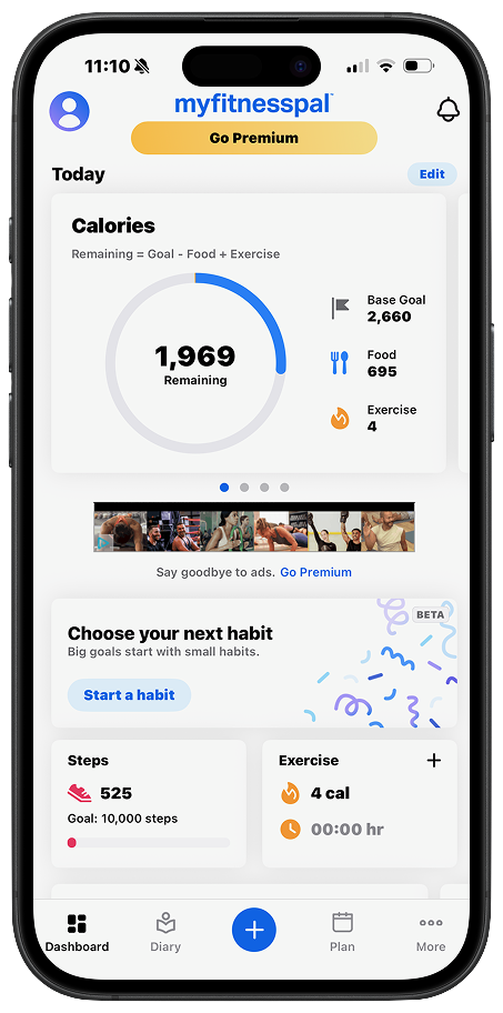
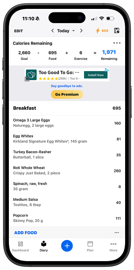
Reviews highlighted frustration with the loss of the app’s former “at-a-glance” usability. Users noted that calorie budgets, intake, exercise, and food logging were spread across multiple screens, while logging food required more steps and less intuitive navigation.
- Information overload and competing sections
- Unclear hierarchy for important metrics
- High friction for beginners
- Lack of guidance and prior-knowledge assumptions
Walking through the current app
Auditing the existing diary and profile screens made the density problem concrete: key numbers competed with ads and secondary actions, and beginners had no clear starting point.
Prototype
Guided daily progress
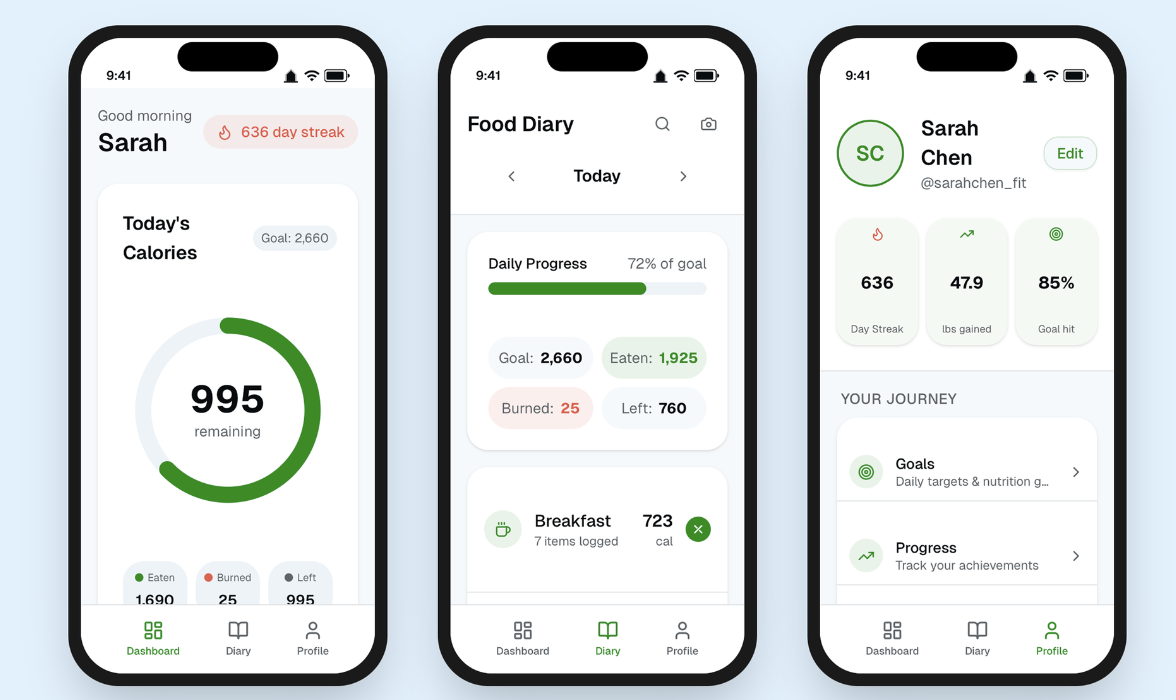
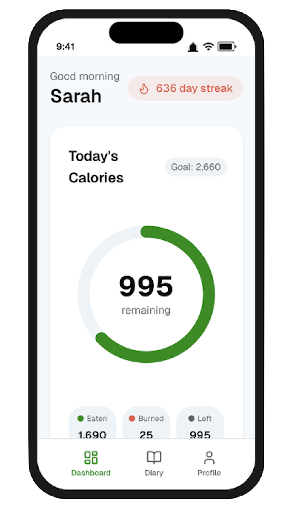
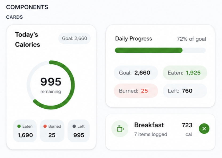
The dashboard centers around a single, highly visible calorie ring supported by a simple breakdown of eaten, burned, and remaining values. Circular and linear progress indicators make daily status easier to interpret without mental calculation.
A food diary and profile that stay out of the way
The food diary and profile move from dense settings screens into calmer, card-based views that surface what matters without extra taps.
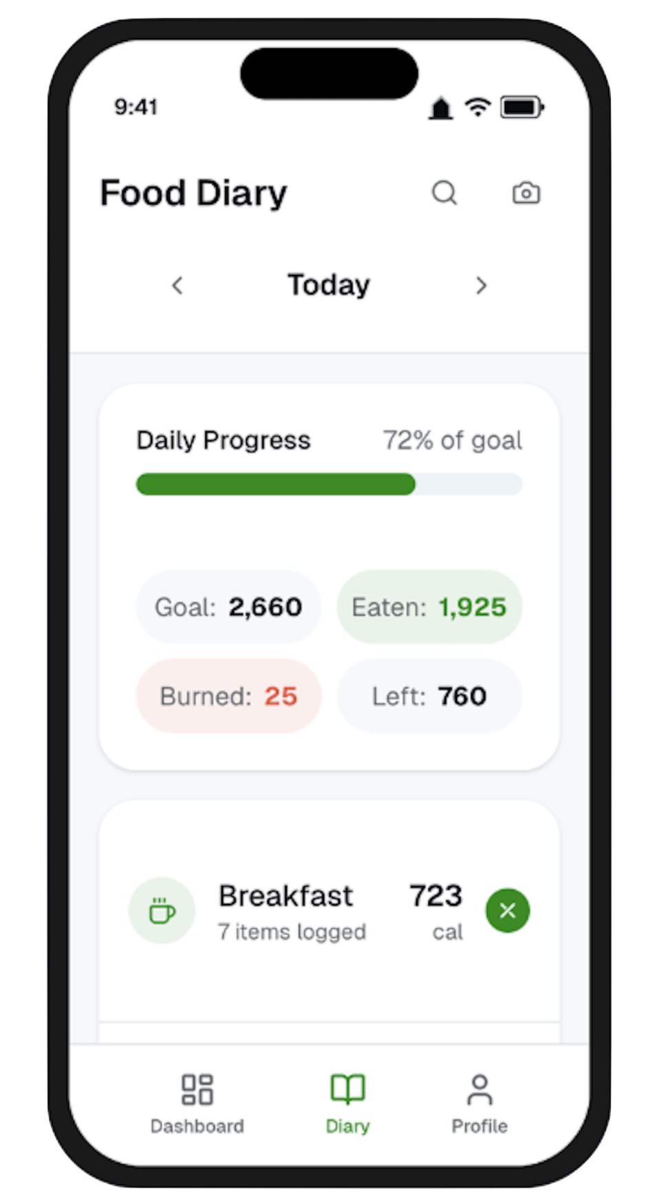
Food diary
Meals are grouped into clean, card-based sections with clear totals, and key actions are easier to reach, so a day’s intake is scannable at a glance.
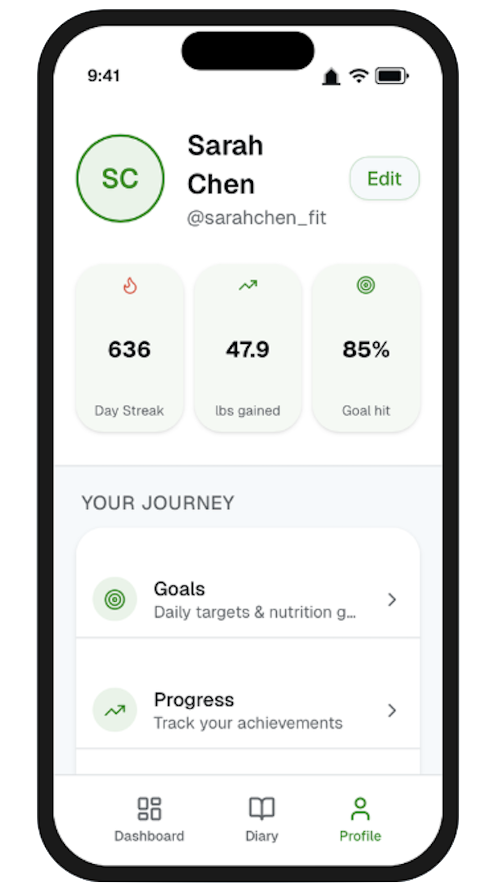
Profile
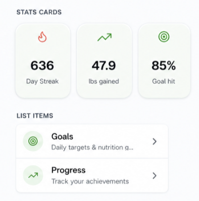
The profile screen shifts from a static settings page into a personal progress hub, turning streaks and goal completion into cards worth checking back on.
Design System
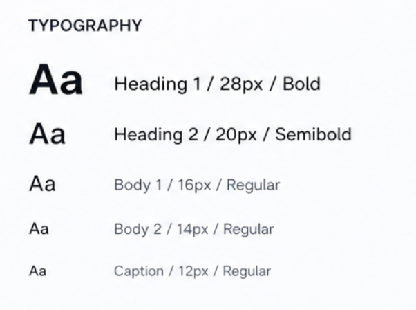
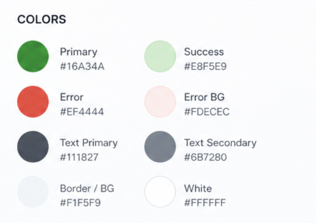
A small, functional system
Green marks primary actions, progress, and success; red is used sparingly for negative values; neutral tones carry structure. Cards, progress rings, stat blocks, and list items were built as a small, reusable library so new screens stay consistent.
Key Takeaways
Balancing modern design with usability
The redesign reinforced that clarity and efficiency matter more than visual novelty in a data-heavy experience. Small changes to hierarchy, navigation, and information grouping can significantly improve satisfaction for people who rely on speed and familiarity.
Next project