

Gap Analysis Dashboard Redesign
The Department of Fisheries and Oceans Canada (DFO) monitors marine ecosystem variables across Canada and relies on an internal dashboard to support conservation and policy decisions. The existing Ecosystem Variables (EV) dashboard had major usability issues making it difficult for scientists and analysts to find relevant data, interpret coverage gaps, and collaborate effectively. Our goal was to redesign the EV dashboard to better match real workflows: find data faster, analyze spatial gaps more accurately, and collaborate in-context without adding complexity.
Roles
Research, Product Design,
UX/UI Design, Wireframing, Prototyping
Product Overview
Fisheries and Oceans Canada
Team
Aaron Cappuccio
Jingyi Lai
Quanling Liu
Jake Gu
Timeline
January - April 2025
Hours Contributed: 80
Tools
Figma
Miro
Project Brief
This project was completed as part of a capstone course at the University of Toronto, where external organizations partnered with students to explore real-world design challenges. The Department of Fisheries and Oceans (DFO) provided a problem space focused on improving their existing Ecosystem Variables (EV) Dashboard.
The objective was to conduct user research, evaluate the current system, and design a user-centered solution that enhances data accessibility, visualization, and collaboration for marine scientists and analysts. Working within real organizational constraints, the project emphasized translating stakeholder needs into practical design improvements.
The final outcome is a redesigned dashboard prototype that demonstrates how improved filtering, visualization, and integrated collaboration can support more efficient, data-driven decision-making.
The Problem
The existing EV Dashboard presented several usability challenges that made it difficult for users to efficiently analyze and act on data.
Key issues included:
Limited filtering and search capabilities
Low spatial resolution in visualizations
Lack of actionable data insights (gap analysis)
No integrated collaboration tools
Poor onboarding for new users
These limitations made it harder for users to find relevant data, interpret patterns, and communicate insights effectively.
Context
Research & Discovery
Research Goals
Understand how users search for and interpret ecological data
Identify pain points in filtering, visualization, and navigation
Explore how users collaborate and share insights
Evaluate trust and understanding of data sources
Methodology
We conducted semi-structured interviews with users familiar with data analysis tools such as Power BI. Each session lasted approximately 30 minutes and focused on real-world tasks such as locating specific datasets, interpreting visualizations, and navigating the interface.
Participants were encouraged to think aloud while completing tasks on the prototype, allowing us to capture both their actions and decision-making processes.
In addition, usability testing was conducted using a Figma prototype to evaluate how easily users could:
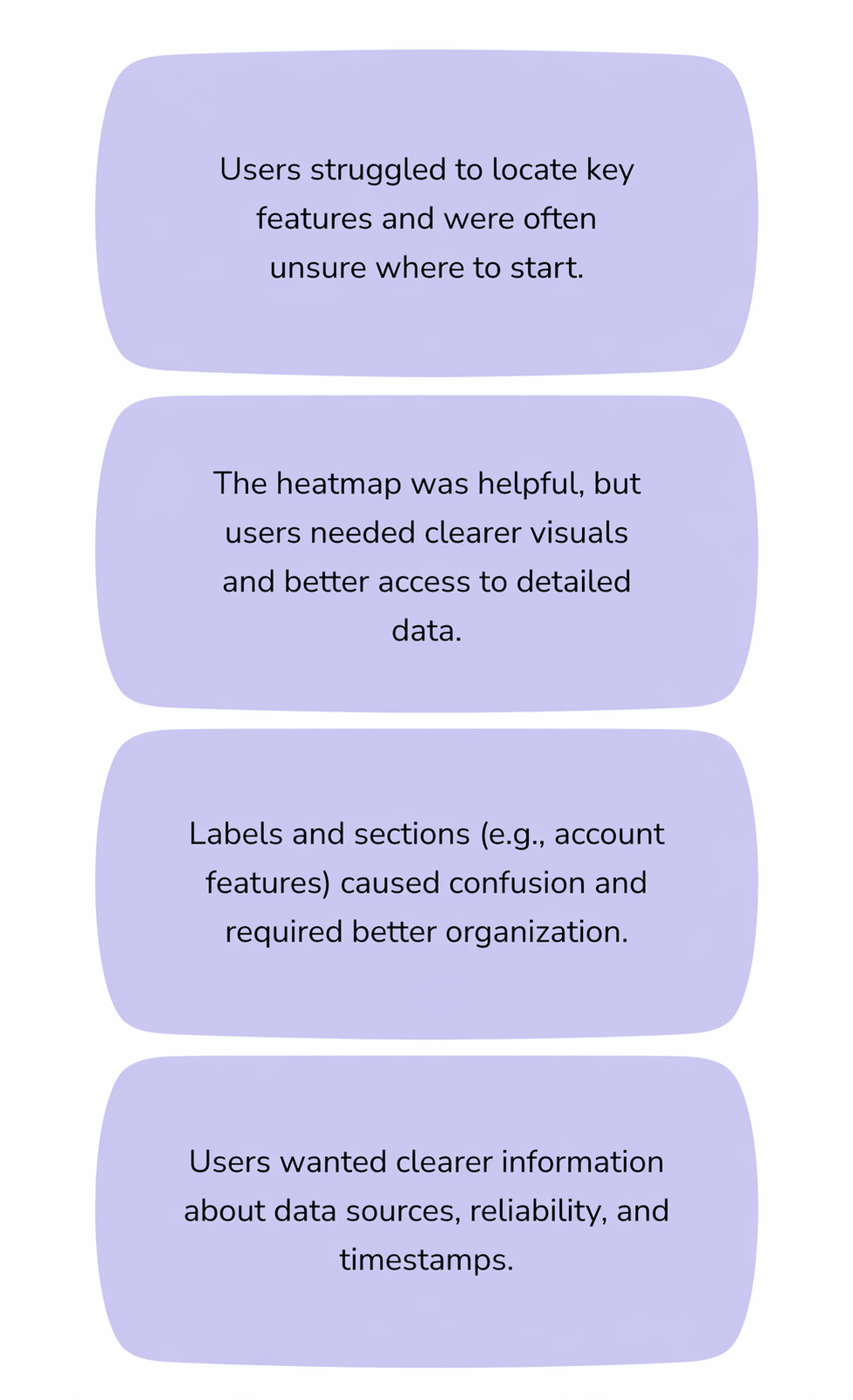
Locate key features such as filters and metadata
Interpret visualizations like heatmaps
Navigate account and collaboration features
These sessions helped identify both usability issues and mismatches between user expectations and system behavior.
Key Challenges Identified
Low-Fidelity Designs
Early in the design process, low-fidelity wireframes were created to quickly explore layout, structure, and core functionality without focusing on visual detail. These sketches helped translate research insights into tangible interface concepts and allowed for rapid iteration based on feedback.
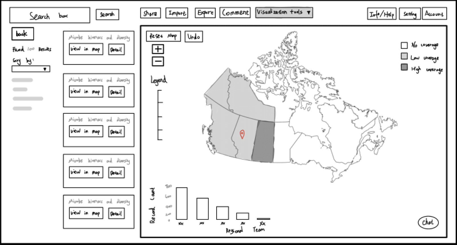
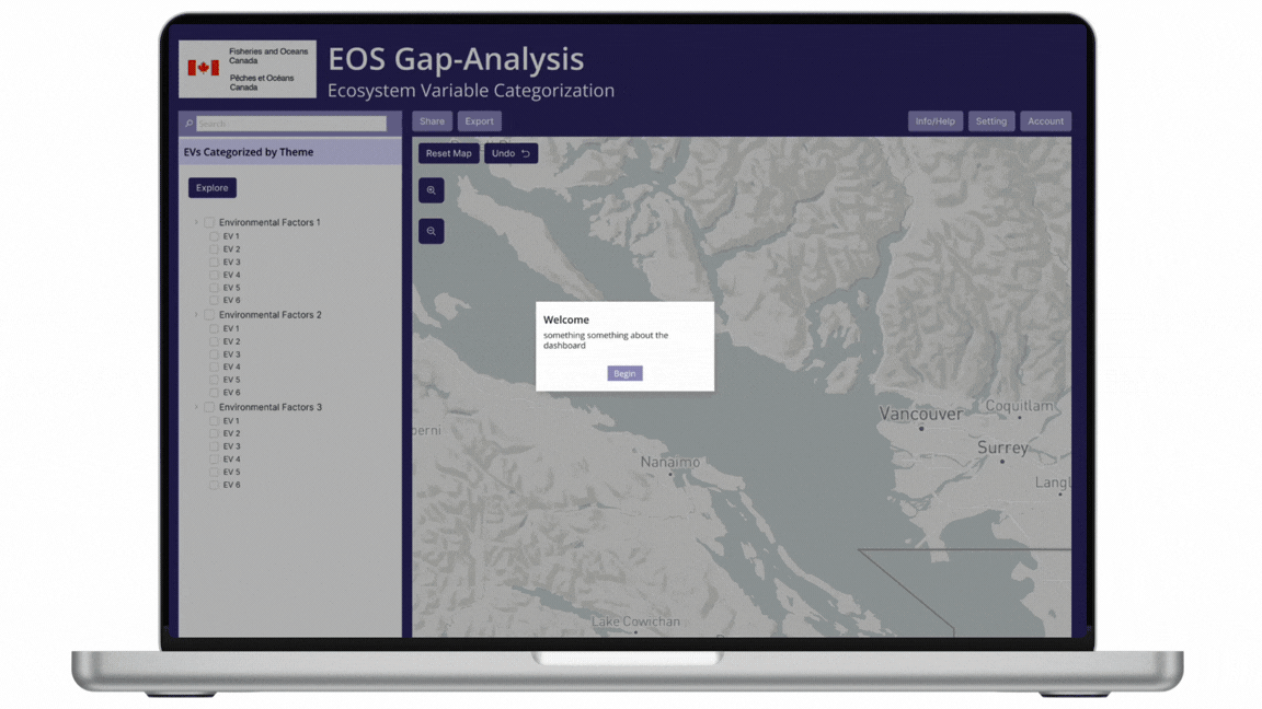
The initial designs focused on establishing a clear information hierarchy, with a persistent top navigation bar for key actions such as search, sharing, and data tools. A two-panel layout was introduced, separating data exploration (map and visualizations) from supporting content (filters, results, and metadata) to reduce cognitive load and improve usability.
Key features explored in these wireframes include:
Search & Results Panel: A dedicated space for filtering datasets and browsing results, making data discovery more structured and accessible.
Interactive Map View: A central visualization area for exploring spatial data, with zoom controls and legend placement for clarity.
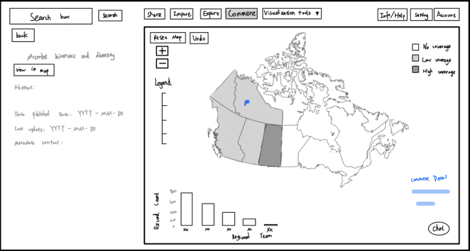
Data Detail View: A side panel displaying metadata such as publication date, updates, and dataset descriptions to improve transparency.
Collaboration Tools: Early placement of features like comments, sharing, and chat to support integrated communication.
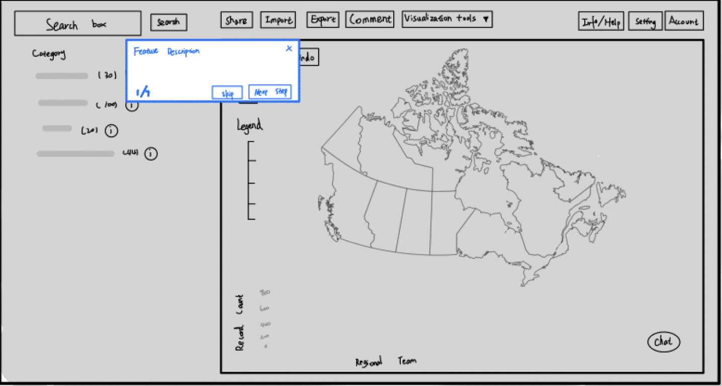
Onboarding Flow: A guided tutorial overlay was introduced to help new users understand key features and navigation.
These low-fidelity designs allowed for quick validation of layout decisions and interaction patterns before moving into higher-fidelity prototypes. They were particularly useful in identifying usability issues early, such as unclear navigation, overcrowded panels, and the need for better separation between exploration and detail views.
Wireframes
Pictured above: Explore → More details → View in Map
Pictured above: Tutorial Flow
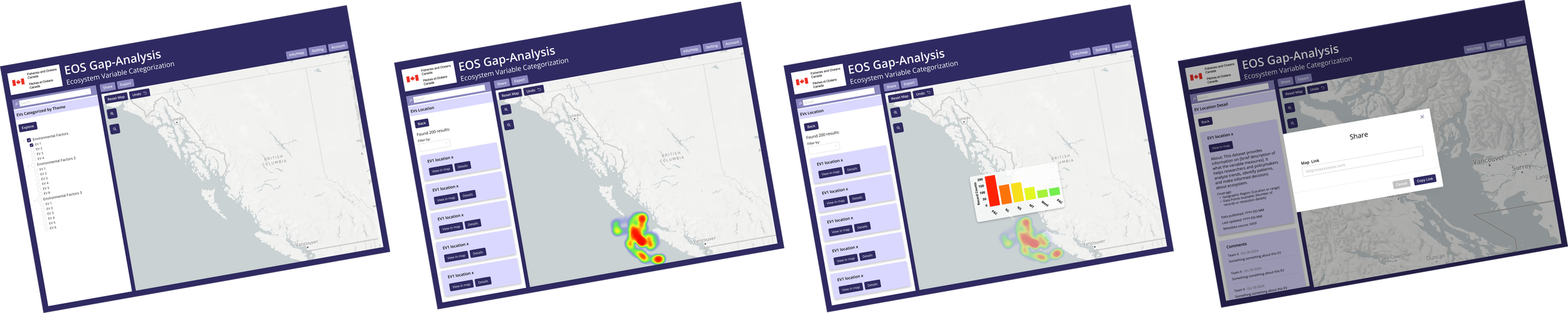
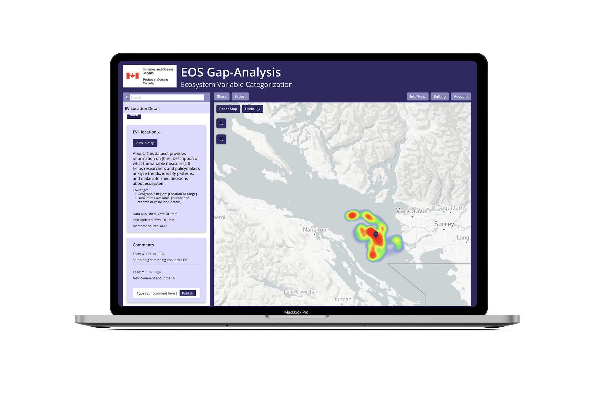
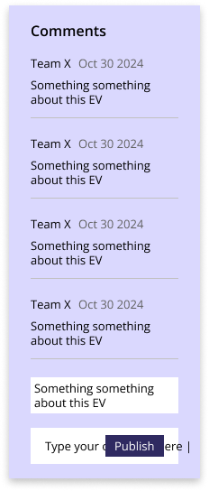
Integrated Collaboration Tools
Users can leave comments directly within the dashboard and generate shareable links for datasets. This keeps discussions contextual and eliminates the need for external communication tools.
Onboarding & Guided Tutorials
New users are supported with a welcome flow and step-by-step tutorials, helping them understand the system quickly and confidently.
Supporting Features
Additional features such as account history tracking and an in-platform help section improve long-term usability and user confidence.
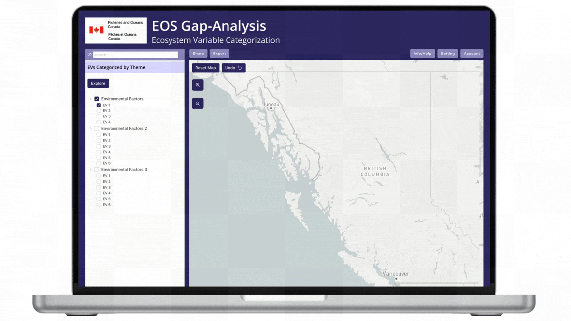
Prototype
Advanced Filtering System
Users can filter data by multiple variables and biogeographic regions, as well as define custom areas directly on the map. This allows for more precise and relevant data exploration.
Improved Data Visualization
A heatmap system highlights areas of high and low data density, making patterns and gaps immediately visible. Users can zoom into finer spatial levels and hover for detailed statistical insights.
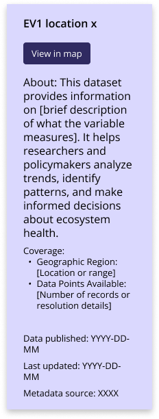
Metadata Transparency Panel
A dedicated panel displays key dataset information such as source, timestamp, and description. This improves trust and allows users to quickly validate the data they are using.
Design System
Checkbox Component
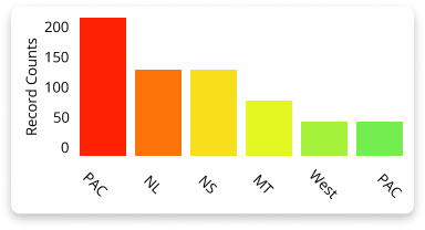
Data Visualization (Bar Chart)
The bar chart component is used to display dataset distribution and comparisons across regions.
Structure: Vertical bars with labeled axes and categories
Color Usage: Distinct colors differentiate regions and improve visual clarity
Interaction (future): Potential for hover states to reveal exact values
Use Case: Helps users quickly identify patterns, trends, and data density
This component transforms raw data into an easily digestible visual format, supporting faster analysis and insight generation.
The checkbox component is used for filtering and selection, particularly within data categories and coverage options.
States: Default, Selected, Hover
Visual Feedback: Filled state clearly indicates selection
Use Case: Allows users to toggle data layers (e.g., coverage levels) on and off
Design Goal: Simple, recognizable interaction that supports quick decision-making
This component ensures users can easily control what data is displayed without adding unnecessary complexity.


Data Detail Card
The data detail card presents key information about a selected dataset in a structured and readable format.
Content Structure: Title, primary action (e.g., “View in map”), description, and metadata
Hierarchy: Clear separation between summary, description, and technical details
Use Case: Provides users with context needed to understand and evaluate datasets
Design Goal: Improve transparency and support informed decision-making
The layout prioritizes readability, allowing users to quickly scan high-level information while still accessing detailed metadata when needed.
Key Takeaways
Designing for Complex Data Systems
This project highlighted the importance of simplifying complex datasets through clear visualization and structured interaction design.
Balancing Detail and Usability
Providing advanced functionality while maintaining clarity was critical for supporting both expert and less technical users.
Contextual Collaboration Matters
Embedding communication directly within the interface significantly improves workflow efficiency and user experience.